|
|
something here |
02 Physical Prototype |
Designing the form
To demonstrate the visual qualities of our design prototype, we constructed a physical prototype. We ended up choosing a physical form factor that we felt would be familiar to a senior, and would not look out of place in their homes. After a several visits to different stores, we found the perfect box-shaped form for our music player.
Choosing the Form Factor and the Tools
The Musical Box
We were able to find a form factor that not only fit the aesthetics of a senior's living arrangements, but it was also a familiar form factor to them since seniors often commented that they stored mementos in shoeboxes. The outside of the box is a leather-type of material. The stitching around the edges of the box make it much easier to grip, and help make the lid easy to grip, which is an important feature for seniors who may have limited or diminishing dexterity. |
 |
Prototyping Tool
The inside of the musical shoebox was predominately prototyped with the help of a laser cutter. Both clear and black colored acryllic plastics were used to prototype the inside of the box. To use the laser cutter, pieces were first designed in Adobe Illustrator, following specific guidlines so that the laser cutter could properly interpret how to make the cuts into the acryllic. |
 |
Prototyping the Inside of the Musical Box
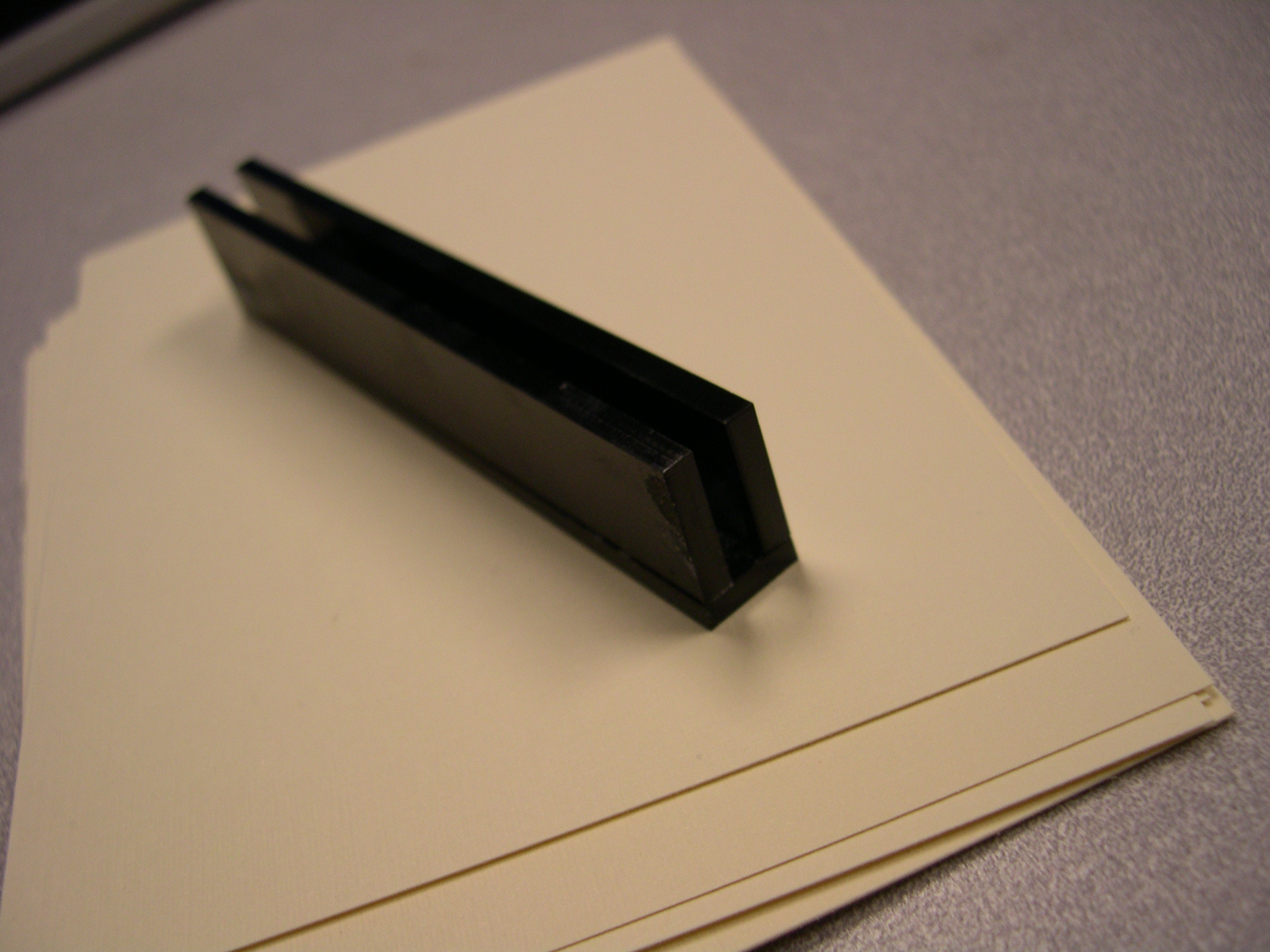
Note Card Holder, take 1
A primary part of the box would be the note card holders. We initially designed the holders to be like the image on the right. However, after a quick testing with a variety of users, we found that it would be better not to design a holder which would require seniors to explicitly put the note card inside such a small space.
|
 |
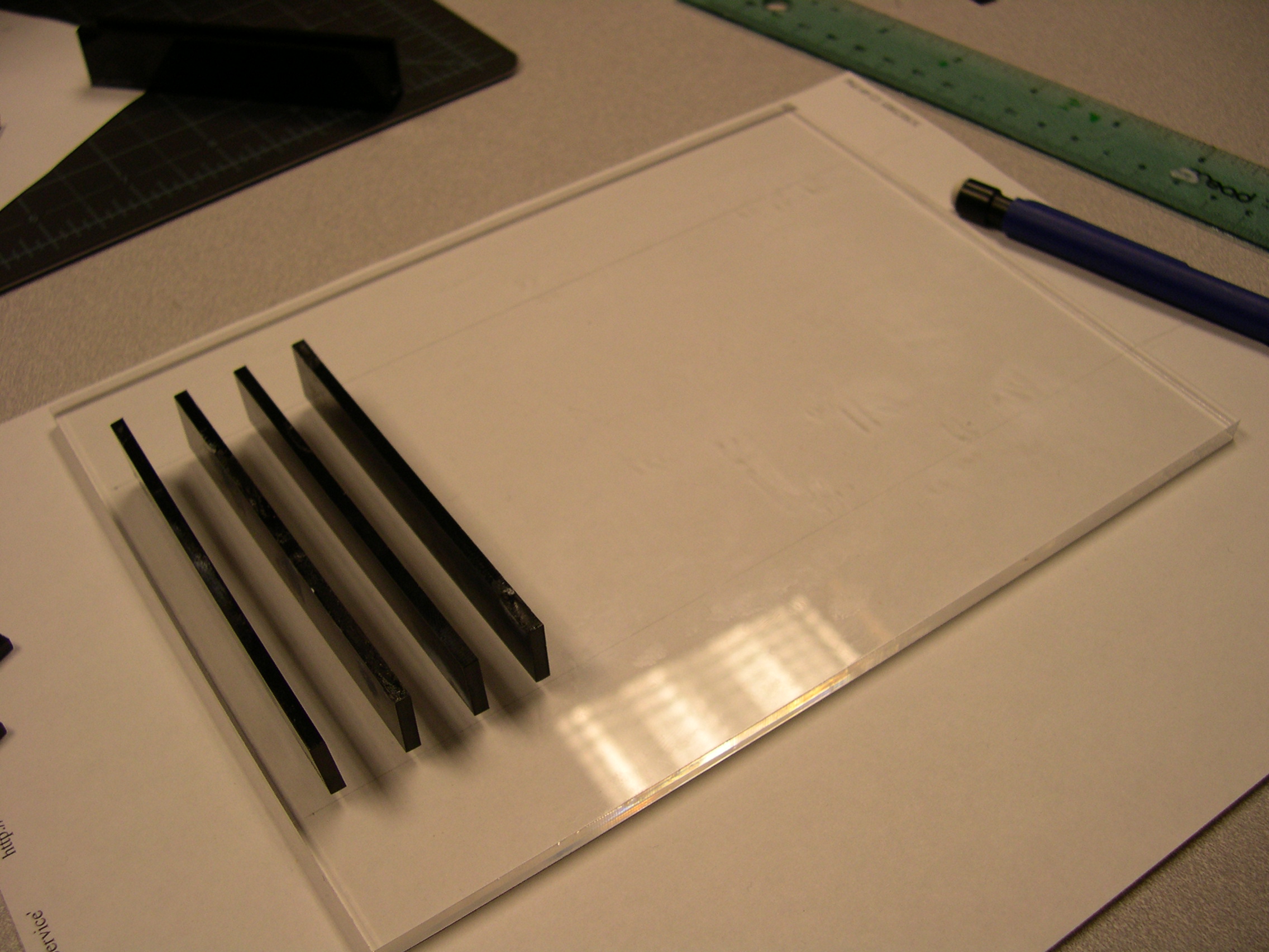
Note Card Holder, take 2
Instead, we took a much simpler approach to designing the note card holder. This time we just needed to place a series of holders along a flat surface. Now there are more holders where the note cards can fit into, which will make it easier for seniors to take the cards in and out of the box. |
 |
Note Card Holder, take 2
Here are how the note cards would work once the cards are placed in between the holders. We designed the holders to be a specific width apart so that we could enforce the slanted angle of the cards. This makes it easier to read or glance at the front of the note cards without having to explicitly remove it from the box. |
 |
Control Panel, Sketches
These were some sketches we did to design possible layouts of the control panel for the music player. We knew that we wanted a simple interface, so we tried to keep the buttons to a minimum. We also wanted to incorporate a "share" button, so that we could build into the design prototype the aspect of exchange note cards. The thinking would be that the share button would provide a sticker which would distinguish the note card as a musical note card (vs. a traditional note card). |
 |
Control Panel, Top
The top view of the control panel. We settled on having just two buttons: 1) one button controls the play feature of the music player, and 2) the other button provides the sticker. The play button has a raised icon on it, so that seniors can distinguish the buttons either by the shape & size of the button as well as the tactile feedback of the button. We decided not to have an icon for the share button so that we would not induce more confusion by introducing a new icon to seniors. The control panel also has a note card holder. Whenever a card is placed in this particular holder, and the play button is pressed, then the music associated with that card will start playing. |
 |
Control Panel, Side
The closer view of the control panel shows how the note card holder is clear. This is to allow the holder not to obstruct the details of the note card. Also, it is designed to be visually distinct from the black control panel. |
 |
Control Panel, Removable
The lid of the control panel is also designed to have a space so that seniors can easily slip their hands and lift up the lid.
This would be a useful feature whenever seniors would need, for example, to change a roll of stickers for the music player. |
 |
Other Features of the Musical Box
Speakers and Volume Control
The lid was made to be the portable aspect of the musical player. The volume dial was made out of two bottle caps. The text labels were made to be large font, so that it would be easy for seniors to read. The labels were cut out of acryllic and glue to the lid. The black line on the dial also provides a visual cue as to the current setting. We choose a volume dial because it affords easy access to the volume regardless of the orientation of the speakers (whether they are lying flat on the table, or propped up against something. )
The speakers were made out of cardboard, and wrapped in black pantyhose to give the texture of speakers. |
 |
Blank Note Card Holder
While the bulk of the box is given to storing cards that are received from other people, we thought it would also be nice to include a section in the box where blank note cards could be stores. This way whenever memorable music plays, the user can take out a blank note card, jot down a note, stick on a musical sticker (from the share button), and be on their way to sharing the musical note card.
In order to distinguish this note card hold from other holders, the holder was designed differently. Both the front and the back of the holder are designed to be shaped as a musical note. This also allows for a taller backing to the holder, which makes the blank note cards stnad straighter (and not an angle), since we do not want these blank note cards to interfere with the glanceability of the received note cards that are also in the box. |
 |
| |
|
| |
|
| |
|
Design Prototype -
Putting the Pieces Together! |
 |
|
 IID.2006 - Project 4