 IID.2006 - Project 4
 Research Research |
 Synthesis Synthesis |
 Design Design |
 Solution Solution |
 |
something here
inTune |
|||||||||
research |
|||||||||
|
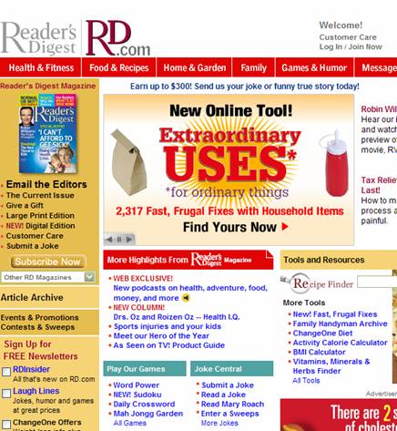
We reviewed a plethora of media as a second method of trying to understand what are the user needs for the senior demographic. We looked at magazines, internet sites, radio stations, and current playersthat either: 1) are specifically geared toward seniors, 2) explicitly address senior-related issues, or 3) marketed in hopes of attracting seniors. Websites
We noticed that while these websites provide important senior-related information, they lacked a consistent feel between them. Moreover, we also found that these sites often had relatively complex navigation maps, where even we were often astounded at the amount of information that the website was displaying. We concluded that these websites were focused more on the content, and were not really paying any particular attention to catering to their target audience, who presumably would have just as much as trouble as we had with navigating through the information. Printed MaterialWe initially looked at magazines targeted at seniors (e.g. AARP magazine), but after a quick survey of seniors through informally asking our senior-aged neighbors and observing seniors at the libraries, we noticed that seniors in fact do not view those magazines as part of their leisurely reading. Rather they read materials which they have been reading since their adulthood. With that in mind, we choose materials like:
Color schemesWhile these sites didn't offer much consistency in terms of UI layout, or grid patterns, we did get a sense of the color schemes that these websites tended to use:
From these color swatches, we observed that the variety in the design for various types of media supposedly geared towards seniors did not seem to be very instructful for providing clear design guidelines that could easily be applied to our music player design.
|
||||||||
| IID 2006 . Human-Computer Interaction Institute . Carnegie Mellon University |


