

For more information on the creation of these visualizations,
see
Three-dimensional
visualization of sediment chemistry in the New York Harbor
(1996).
Data Explorer Communiqué, 4(1), 1-3.
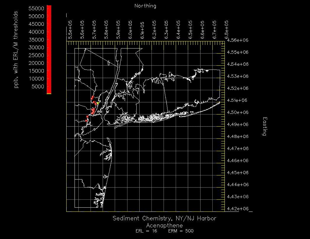
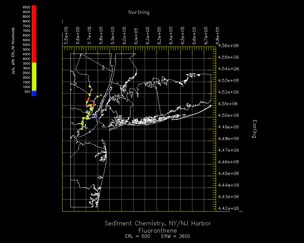
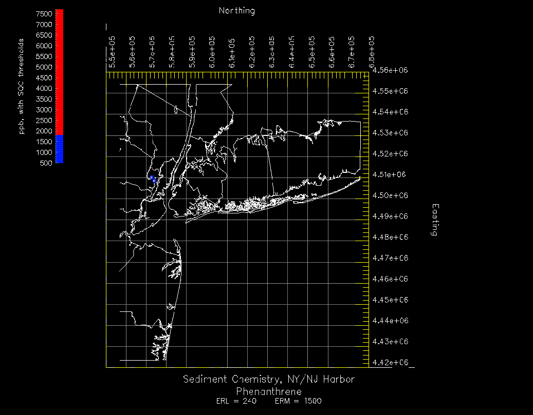
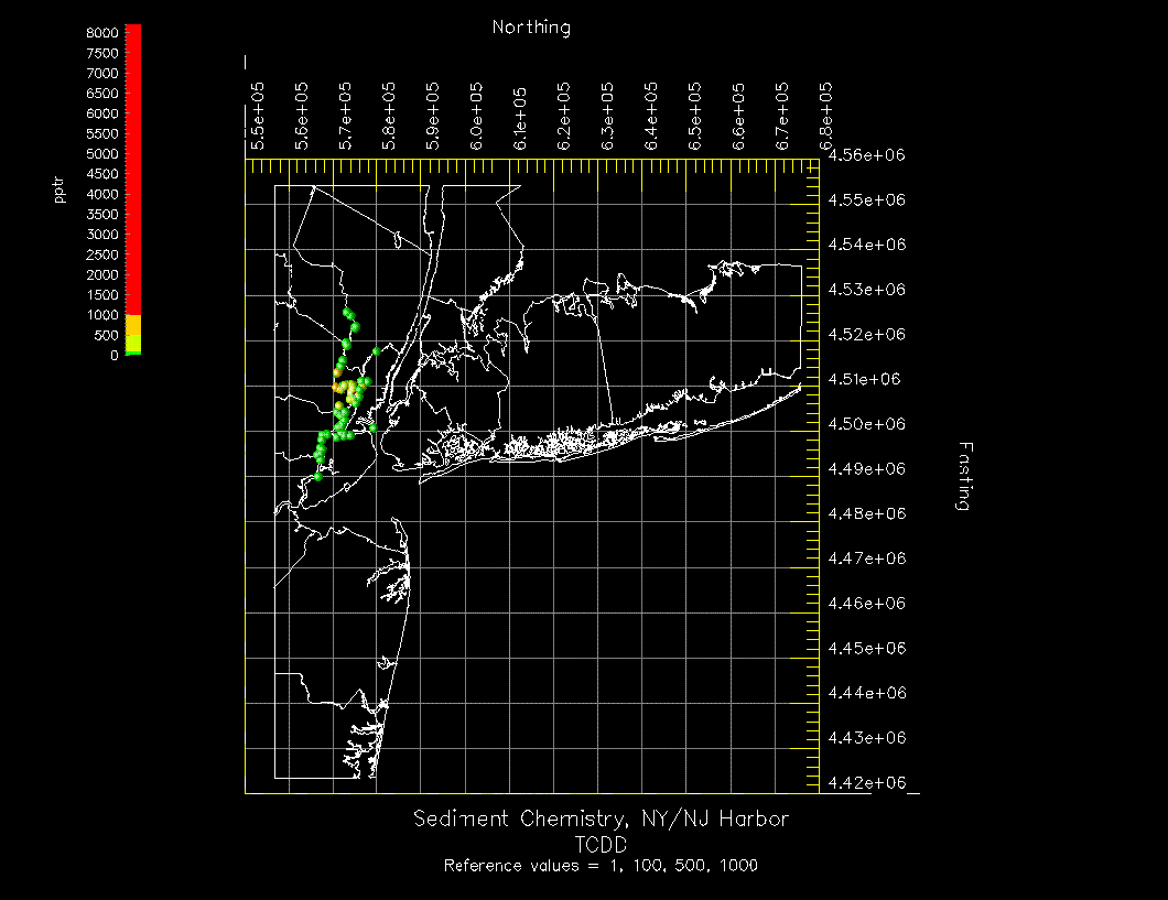
A wealth of data is available on the contamination of sediments in the New York/New Jersey Harbor. Using IBM Data Explorer, we have created visualizations of these data in the table below. Harbor-wide views are two-dimensional visualizations looking down from above, and three-dimensional views are from a cross-section perspective. Enhancements for future visualizations may be seen in the following section.
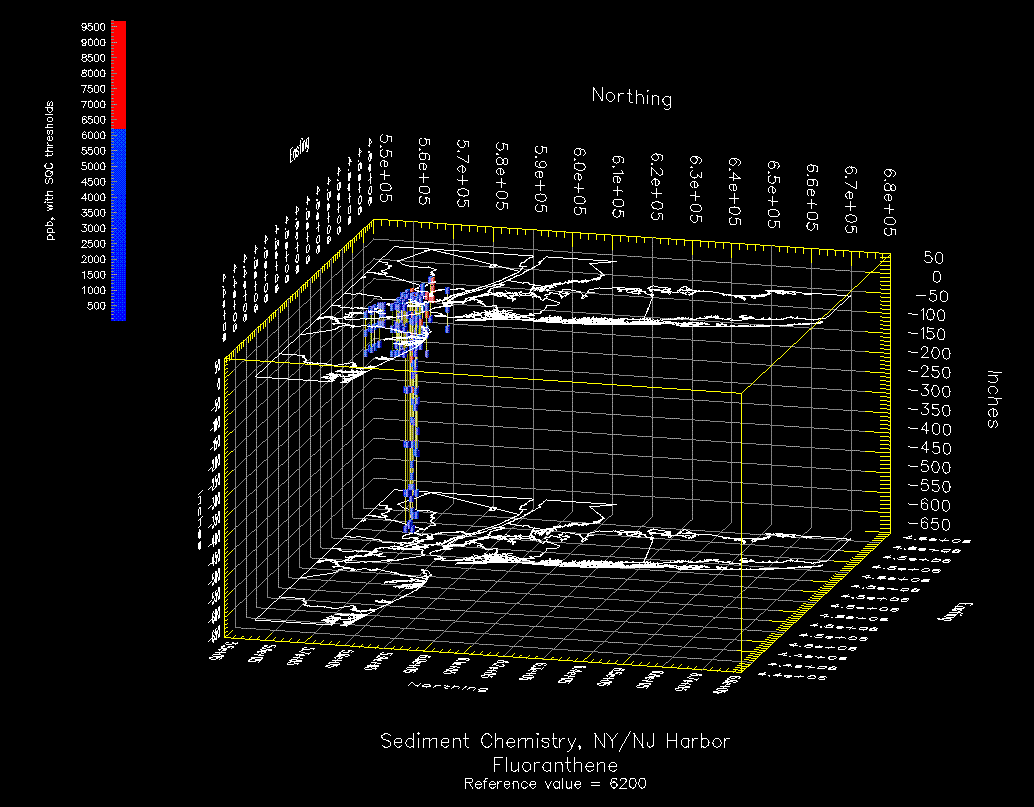
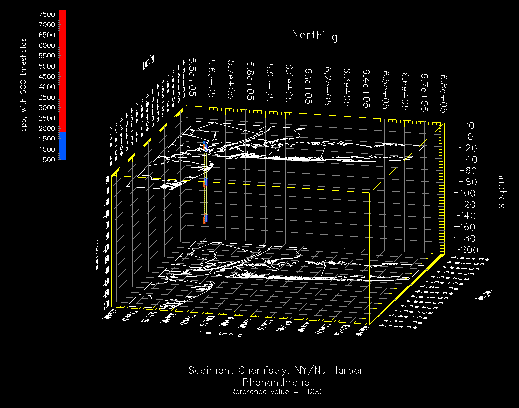
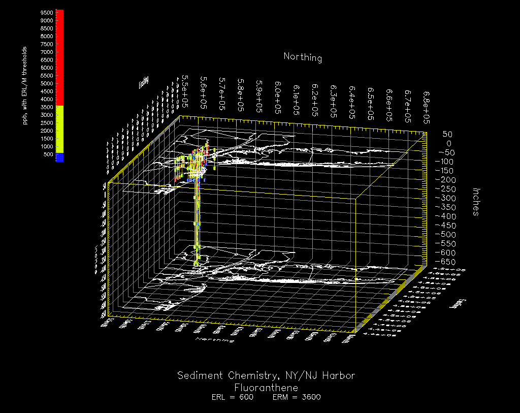
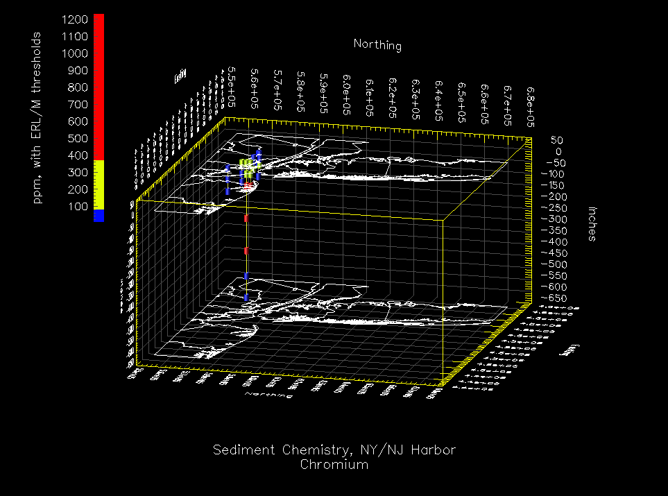
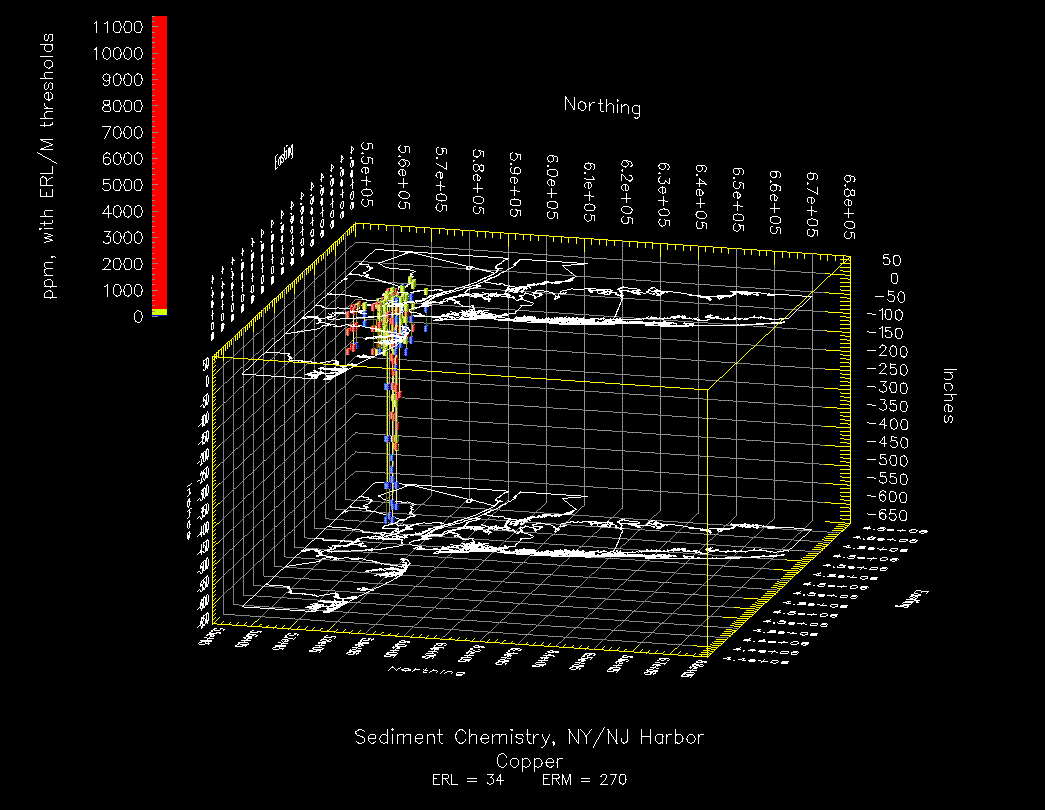
The three-dimensional views represent cores which have been extracted from beneath the harbor and the concentrations that were found at varying depths. A single core is denoted by a vertical yellow line running the length of the core. The colored cylinders represent the results of testing the core at that location. Locations are represented by Northing and Easting coordinates and by depth in Inches. Harbor-wide views show the locations of the cores and the concentration of the upper-most sample.
Color bars show the range of the data; different colors indicate the areas between reference values. Blue always indicates the range of data below the lowest reference value, and red always indicates the range of data above the highest reference value. Green, yellow, and orange are the colors for mid-range data. Most visualizations have two or three colors; some views have no data falling below the first reference value, and therefore the color range starts with yellow or red.
Using the MAXUS data set visualized in the table below, we have prepared some views demonstrating our visualization capabilities. Let's start by looking at an enhanced version of the Harbor-wide View of Fluoranthene with ERL & ERM thresholds. Note that this view has an inset map showing the location in the harbor of the sample. All of the views in this section have the inset enhancement.
We can zoom in on the data. Now, let's rotate the Harbor-wide View around the X axis in order to see a Three-Dimensional View. We can zoom in on this as well. Rotating around the Z axis lets us view the data from the other side. Since some of the cores go much deeper than the others, a tighter zoom can allow us to get a closer look at the shorter cores alone.
The solid color scheme was used to make it easy to see at a glance where a data point stands with regard to thresholds; i.e., is it below the lower threshold (blue), between the thresholds (yellow), or above the higher threshold (red)? A color enhancement retains this vital information, yet gives additional information about gradations within the range between two thresholds. The area below the lower threshold is indicated by a dark blue-light blue range; the area between the two thresholds is indicated by a yellow-orange range; and the area above the higher threshold is indicated by a magenta-red range.
This research was sponsored by US EPA Region 2 and the New York
District Army Corps of Engineers. The scientific visualization is being done
by Rensselaer Polytechnic Institute's Department of Decision Sciences and Engineering
Systems. Laurie B. Waisel waisel@rpi.edu
Sponsorship
William A. Wallace wallaw@rpi.edu
29 September 1995
MAXUS DATASET, 1990-1995
Reference Value Type
Harbor-wide Views
3D Views
Sediment Chemistry
SQC
Acenapthene
Acenapthene
Dieldrin
Dieldrin
Fluoranthene
Fluoranthene
Phenanthrene
Phenanthrene
ERL/M
Acenpathene
Acenapthene
Dieldrin
Dieldrin
Fluoranthene
Fluoranthene
Phenanthrene
Phenanthrene
DDT
DDT
DDD
DDD
DDE
DDE
Anthracene
Anthracene
Mercury
Mercury
Lead
Lead
Cadmium
Cadmium
Zinc
Zinc
Nickel
Nickel
Silver
Silver
Chromium
Chromium
Copper
Copper
NSI
Aldrin
Aldrin
Other
2,3,7,8 TCDD
2,3,7,8 TCDD