Trading is
one of the oldest games in the world. You buy something hoping the price will
increase or you sell something hoping price will decrease so you can buy it
back for less than you paid. Bulls V Bears is a game where players buy and sell
shares of SPY to increase their money.
MONEY: Each player starts with $1,000
of Virtual Money.
RULES: There are two rules in the game.
·
Rule 1. Don’t loose your money.
·
Rule 2. Remember Rule 1.
SCORE: There is one score per trade,
win or loose.
·
A win is ending with more than you started with.
·
A loss is ending with less than you started
with.
PRICE: The amount of the SPY per share.
VOLUME: Number of players in the game.
Answers the question… does anybody care?
PRICE ACTION: Movement up and down of
the price of SPY based on fear and greed among Bulls and Bears.
DATA: Candlestick Charts, the playing
field.
TRADE: Each player makes a Decision to:
·
Buy the
SPY if you think price will rise,
·
Sell the
SPY if you think price will fall, or
·
Wait if
you are not ready to buy or sell the SPY.
·
Exit with
a profit, more than you started with.
FACTS: Price is the most important fact
in the trade; it is the intersection of supply and demand. The second important
fact is Volume which answers the question… does anybody care? Use facts to make
trading decisions. Remember this Grasshopper… the greatest theory must yield to
the ugliest fact and trust but verify.
PLAYERS: Two players, a Bull and a
Bear.
PLAY:
Is the battle between Bulls and Bears with a winner or loser indicated
by each candlestick. Each player makes trading decisions to increase their
money supply by buying or selling SPY shares. They decide how much of their
money to risk on each trade. They open a trade example buy 1 share of SPY at
$85.00 and Sell that share for $86.00 and you have a winning trade.
WINNER: Player with most money and the
end of the game.
References:
Source: http://financial.yahoo.com - Price &
Volume Charts.
Source: http://stockcharts.com - Learn technical analysis and candlesticks.
Source: http://www.swing-trade-stocks.com/stock-trends.html
- Play Book.
Table 1- Stages of a trend. Check with RSI.

Stage 1 is the stage right after a
prolonged downtrend. This stock has been going down but now it is starting to
trade sideways forming a base. The sellers who once had the upper hand are now
beginning to lose their power because of the buyers starting to get more
aggressive. The stock just drifts sideways without a clear trend. Everyone
hates this stock!
Stage 2 Finally stocks break out
into Stage 2 and begin the uptrend. Oh, the glory of stage 2! Sometimes I have
dreams of stocks in Stage 2! This is where the majority of the money is made in
the stock market. But here is the funny thing: No one believes the rally! That’s right,
everyone still hates the stock. The fundamentals are bad; the outlook is
negative, etc. But professional traders know better. They are accumulating
shares and getting ready to dump it off to those getting in late. This sets up
stage 3.
Stage 3 Finally, after the glorious
advance of stage 2, the stock begins to trade sideways again and starts to
"churn". Novice traders are just now getting in! This stage is very
similar to stage 1. Buyers and sellers move into equilibrium again and the
stock just drifts along. It is now ready to begin the next stage.
Stage 4 This is the dreaded
downtrend for those that are long this stock. But, you know what the funny
thing is? You guessed it. Nobody believes the downtrend! The fundamentals are
probably still very good and everyone still loves this stock. They think the
downtrend is just a correction. Wrong! They hold and hold
and hold, hoping it will reverse back up again. They probably bought at the end
of Stage 2 or during Stage 3. Sorry, you lose. Checkmate!
To consistently make money in the stock market, you only want
trade stock trends! But what are the characteristics that make up a trend? I
thought you would never ask.
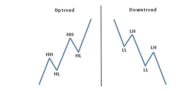
Well Stage 2 is an uptrend that is characterized by a series of higher
highs (HH) and higher lows (HL).
Stage 4 is a downtrend that is characterized by a series of lower highs
(LH) and lower lows (LL).
This creates a series of peaks and troughs on the chart that you can
trade successfully.
Below is the beautiful anatomy
of stock trends:
It is estimated that stocks only trend about 20% of the time. The rest
of the time they move sideways in trading ranges. There is absolutely no reason
to trade stocks that are chopping around like that when you can trade stocks
that are in the trending phases. Trying to trade stocks in trading ranges
(stage 1 and stage 3) is a great way to chew up your trading capital.
ADX indicator measures the strength of a trend and can be useful to
determine if a trend is strong or weak. High readings indicate a strong trend
and low readings indicate a weak trend.
When this indicator is showing a low reading then a trading range is
likely to develop. Avoid stocks with low readings! You want to be in stocks
that have high readings.
This indicator stands for Average Directional Index. On some charting
packages there are two other lines on the chart, +DI and –DI (the DI part
stands for Directional Indicator). Ignore these lines. Trying to trade
according to these two lines is a great way to lose money! The only thing that
we are concerned with is the ADX itself.
Note: This indicator measures strong
or weak trends. This can be either a strong uptrend or a strong downtrend. It
does not tell you if the trend is up or down, it just tells you how strong the
current trend is! If ADX is between 0 and 25 then
the stock is in a trading range. It is likely just chopping around sideways.
Avoid these weak, pathetic stocks! Once ADX gets above 25 then you will begin
to see the beginning of a trend. Big moves (up or down) tend to happen when ADX
is right around this number. When the ADX indicator gets above 30 then you are
staring at a stock that is in a strong trend! These are the stocks that you
want to be trading!
You won’t see very many stocks with the ADX above 50. Once it gets that
high, you start to see trends coming to an end and trading ranges developing
again. The only thing I use the ADX for is an additional filter in my scans, so
that I can find stocks that are in strong trends. I do not even have the ADX
indicator on the charts that I look at when I am looking for setups. Since the
ADX is already factored into the scans, I don't need it added to the chart
itself. I don't pay any attention to the rising and falling of the ADX
indicator. Stocks can go up for long periods of time even though the ADX may be
falling (indicating that the trend is getting weak). The ideal scenario is that
the ADX is rising, but I don't find it necessary to take a trade.
The ADX indicator does not give buy or sell signals. It does, however,
give you some perspective on where the stock is in the trend. Low readings and
you have a trading range or the beginning of a trend. Extremely high readings
tell you that the trend will likely come to an end.
Volume answers the question… does anybody care?
Stock chart volume is probably the most misunderstood
of all technical indicators used by swing traders. There is only a couple of
times when it is actually even useful and if you get right down to it, you
really could trade any stock without even looking at it. But, I’m getting ahead
of myself. First, let’s define what it is: Stock chart volume is the number of
shares traded during a given time period. Usually plotted as a histogram under
a chart, volume represents the interest level in a stock. If a stock is trading
on low volume, then there is not much interest in the stock. But, on the other
hand, if a stock is trading on high volume, then there is a lot of interest in
the stock. Volume simply tells us the emotional excitement (or lack thereof) in
a stock. Stock chart volume also shows us the amount of liquidity in a stock.
Liquidity just simply refers to how easily it is to get in and out of a stock.
If a stock is trading on low volume, then there aren't
many traders involved in the stock and it would be more difficult to find a
trader to buy from or sell to. In this case, we would say that it is illiquid.
If a stock is trading on high volume, then there are many traders involved in
the stock and it would be easier to find a trader to buy from or sell to. In
this case, we would say that it is liquid. Mistakenly, some traders think that
stocks that stocks that are “up on high volume,” means that there were more
buyers than sellers, or stocks that are “down on high volume” means that there
are more sellers than buyers. Wrong! Regardless if it is a high volume day or a
low volume day there is still a buyer for every seller. You can’t buy something unless someone is selling it to you and you can’t
sell something unless someone is buying it from you! So if all volume
represents is interest in a stock, when is it useful? The only time volume is
useful is when you combine it with price. For example: Expansion of range
and high volume - If a stock is drifting along sideways in a narrow range
and all of sudden it breaks to the upside with an increase in range and volume,
then we can conclude that there is increased interest in the stock and it will
probably continue higher.
Narrow range and high volume - If a stock has very high volume for today but the
range is narrow then this is called churning. In this case, significant
accumulation or distribution is taking place. Ever heard the saying,
"volume precedes price"? Many times you will see volume pick up right
before a significant move in a stock. You can see that interest is building. On
a stock chart, look for volume to be higher than the previous day. This is a
sign that there may be a significant move to come. Don’t get caught up in the
confusing signals of stock chart volume. Use it only as a secondary indicator. Price
action is the most important factor on a chart.
Support and resistance identify areas of supply and
demand. But what exactly is supply and demand?
Supply is an area on a chart where sellers are likely
going to overwhelm buyers causing the stock to go down. On a chart, we call
this resistance.
Demand is an area on a chart where buyers are likely
going to overwhelm sellers causing the stock to go up. On a chart, we call this
support.
Knowing this, it only makes sense to buy at support
and sell at resistance!
Stocks run into resistance (supply) because those
traders that bought too late and saw the price go down now want to get out at
break even so they sell. Stocks find support (demand) because those traders
that missed the move up now have a second chance to get in so they buy.
The picture
below shows support and resistance and the laws of supply and demand.
The picture below shows support and resistance and the laws of supply
and demand.
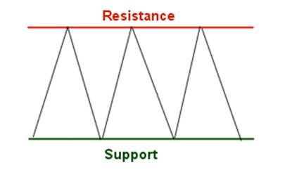
Ok, you probably already knew all that but here is something that most
traders do not know. There are varying degrees of support and resistance.
On the long side, when a stock falls down to a prior low it is more significant
than when a stock falls down to a prior high. On the short
side, when a stock rises up to a prior high it is more significant that when a
stocks rises up to a prior low.
In other words, the more times a
support or resistance area is "hit", the more significant it is. In
the picture above, the support and resistance areas are very significant,
whereas in the second picture these areas are only somewhat significant.
Money is
the most important fact and we must learn to follow it. There are technical
indicators that indicate the direction of money flow i.e., the MFI. There are
two different types of money and it’s important to know when you start to
follow the money. Smart Money comes from winners and dumb money from guess whom
… the losers.
Chart 1. Smart
and Dumb Money Trail

The chart above shows how stocks run into resistance.
But look at the areas that I highlighted in yellow.
What are
these traders doing buying stocks that are running up into an area of supply
(resistance)?
Who are
they, smart or dumb?
Why?
Follow the
money. Smart Money comes from winners and dumb money from guess whom … the
losers.
Chart
2. Smart and Dumb Money Trail

The
chart above shows how stocks find support. But look at the areas that I
highlighted in yellow.
What are these traders doing selling
stocks that are going down into an area of demand (support)? Who are
they, smart or dumb? Why?
They do
that because they are novice traders “dumb money”. They always buy after
significant buying has already taken place into areas of resistance, and they
always sell after significant selling has already taken place into areas of
support. YOUR JOB AS A SWING TRADER IS TO IDENTIFY THE NOVICE TRADERS
BECAUSE THOSE TRADERS ARE THE ONES YOU WILL PROFIT FROM.
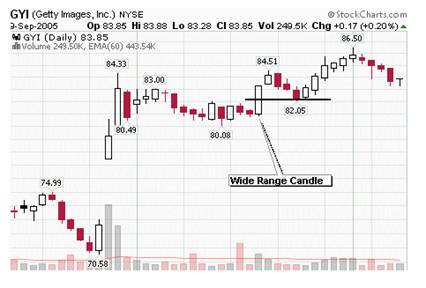
But wait! There are other forms of support and
resistance that are not so common. For example, look for stocks that pull back
and find support halfway into a prior wide range candle. Like this:
Or, look for stocks to pull back and find support
halfway into a gap...

The bottom
line is that you want to be buying stocks where buyers will likely come into
the stock. You want to be selling stocks where sellers will likely come into
the stock. Follow the smart money!
A gap is defined as a price level on a chart where no
trading occurred. These can occur in all time frames but, for swing trading, we
are mostly concerned with the daily chart.
A gap on a
daily chart happens when the stock closes at one price but opens the following
day at a different price.
Why would
this happen?
This
happens because buy or sell orders are placed before the open that cause the
price to open higher or lower than the previous day's close.
If Previous
day close is lower the gap is down, if higher the gap is up, and if equal, its,
unchanged or Doji.
Are all gaps created equal? Nope. There are really
only two significant factors to consider when trading gaps. You have to be able
to identify if professional traders or amateur traders cause the gap. There is
a big difference between the two!
When you are looking at gaps on a stock chart, the
most important thing that you want to know is this: did the professional
traders that do not make emotional decisions cause this gap?
To figure this out you have to understand this one
important concept first. Professional traders buy after a wave of selling
has occurred. They sell after a wave of buying has occurred.
Amateur traders do the exact opposite! They see a
stock advancing in price and are afraid that they will miss out on the move, so
they pile in - just when the pros are getting ready to sell.
Ok, so let's break this down, shall we?
·
If a stock
gaps up after a wave of buying, uptrend, has already occurred, these are
amateurs buying the stock - look to short.
·
If a stock
gaps down after a wave of selling, downtrend, has already occurred, these are
amateurs selling the stock - look to go long.
Source: http://www.swing-trade-stocks.com/stock-trends.html
Short term
moves between 3 and 5 days.
1. How can
I get in with the least risk to my trading capital?
2. Which
way is money flowing? Check the MFI.
3. What is
the Strength of the Trend? Check the ADX.
4. What is
the Stage of the Trend? Check RSI.
5. What is the Trend? MA.
6. What is Support and Resistance? Bollinger
Bands.
7. What is the best entry? MACD.
8. What is the Limit Order to Open?
9. What is your Price Target?
10. What is the Stop Loss Order?
TRADING STOCKS:
Relative
Strength: Relative Strength refers to
how strong a stock is relative to something else. This could be either how
strong it is compared to the overall market or the industry group that it is
in. If it is
stronger, than then we say that it has relative strength. If it is weaker, than
we say that it has relative weakness. To improve your odds of a successful trade, you want
only want to trade stocks on the long side that are stronger than the market
itself. One way to do this is to compare it to the S&P500. Since we are
trading the SPY we are in fact trading the market so we can skip this step.
Remember to include the Relative Strength when trading stocks.
Timing: Your market timing strategy is
critical to your success as a swing trader. When the stock market rallies, 3
out of 4 stocks will move up with the market. On the other hand, when the
market sells off, 3 out of 4 stocks will decline with it. Knowing this, doesn’t
it make sense to time your trades to the market? YES!
Moving averages are trend following indicators. As
such, they will only work well in trending markets - not when they are the
market is trapped in a trading range.
5 and 20
EMA: The first thing you want to
look at is a chart of the SPY. Look at the 5 EMA and 20 EMA to determine if you
should be focusing on long positions or short positions. Here are the rules for
timing your trades to the market using moving averages. If the short EMA is
above the long EMA, you should be focusing on long positions only. If
the Short EMA is below LONG EMA, you should be focusing on short positions
only. This simple technique will tell you what type of trades you will be
concerned with right now. It identifies the underlying trend to keep you on the
right side of the market.
Ok, now we know whether or not we will be trading on
the long side or the short side. Now we need to answer the question of when
to buy and when to sell. That is where Williams %R comes in…
Williams %R is useful to get a general idea of
when the market has reached an extreme and is likely to reverse. It calculates
the close in relation to the range over a set period of time.
The default setting in most charting packages has it
set at 14 periods, but we would like it to be a little more sensitive than that
so we will use a 3 period setting. Here are the rules for timing your trades
using Williams %R.
When the short EMA is above the long EMA, we will look
to go long when Williams %R is less than -80. When the
short EMA is below the long EMA, we will look to go short when Williams %R is
greater than -20.
Williams %R will often give early signals - sometimes
too early. Once Williams %R gets into oversold or overbought territory, look to
the left and identify support and resistance levels.

In the chart above of the S&P 500, notice how we
ignore short positions when the 10 SMA is above the 30ema and only focus on
longs. Even though Williams %R is overbought, above -20, we only want to trade
in the direction of the trend. Also, notice how we ignore long positions when
the 10 SMA is below the 30 EMA and only focus on short setups. Again we only
want to trade in the direction of the trend. On the right edge of the chart the
10 SMA has just crossed down through the 30 EMA so we can no longer trade on
the long side. Instead, we will manage our existing trades and wait for
Williams %R to get above -20 to focus on the short side.
The Volatility Index can be used to time your trades
to the market. It is mainly used to trade the S&P Futures and Spiders
(SPY), but you can use it to identify when the overall market (S&P 500) is
likely to reverse.
What is the
Volatility Index “VIX”? This index measures future volatility. It provides us
with a good indication of the level of fear and greed in the market. Volatility is mean reverting. This means that periods
of high volatility will eventually revert to their mean and periods of low
volatility will eventually rise to their mean or what goes around comes around.
High readings usually occur after a market sell-off and you will want to be
focusing on long positions. Low readings usually occur after a rally and you
want to be focusing on short positions. We always do the opposite of the crowd!

The first one uses the 10 period moving
averages. You can see this moving average on the chart above. When the VIX gets
10% above the 10 period moving average, the S&P 500 will be selling off. It
has reached an extreme and will be likely to reverse back to the upside. You
want to be looking for long setups because this has correctly predicted
market direction nearly 70% of the time! This is the opposite for short setups. Look for the
VIX to get 10% below the 10 period moving average to look for short setups.
When the RSI gets above 70 the VIX is overbought and
the market is oversold. Look for long setups. When the RSI gets below 30 the
VIX is oversold and the market is overbought. Look for short setups.
Remember that the VIX reversals are used to identify
market extremes in the S&P 500. So in order for these signals to be
significant, you will want to use them to trade this index itself (SPY) or find
charts of stocks that look similar to the chart of the S&P 500.
Once you start to learn the VIX reversals, and begin
to see how often the market actually reverses when you get multiple signals all
pointing in the same direction, you will realize just how valuable this
knowledge is. You will also gain an enormous edge over other traders!
See how we are NOT predicting what is going to happen
in the future. That is a waste of time. Instead, we are reacting to whatever
the chart tells us to do.
Use these
market timing methods to identify when to establish long or short positions.
Once you are in the SPY watch price action itself and forget about the market.
Then, use your specific entry and exit strategy to get into and out of the SPY.
Requires membership in http://stockcharts.com then you can scan for
stocks to put on your watch list.
Script for Long Screen:
[type = stock] and [country = us]
and[daily ema(60,daily volume) > 150000] and
[daily high < yesterday's daily high]
and
[yesterday's daily high < 2 days ago
daily high] and
[sma(10, close) > ema(30, close)]and
[daily close > daily ema(30,daily
close)]and
[daily close < daily sma(10,daily
close)]and
[daily close > daily sma(200,daily
close)]and
[weekly sma(10,weekly close) > weekly
ema(30,weekly close)]and
[ADX Line(10) > 20.0]and
[close >= 5]
Script for Short Screen:
[type = stock] and [country = us]
and[daily ema(60,daily volume) > 150000] and
[daily low > yesterday's daily low]
and
[yesterday's daily low > 2 days ago
daily low] and
[SMA(10, close) < EMA(30, close)]and
[daily close > daily SMA(10,daily
close)]and
[daily close < daily EMA(30,daily
close)]and
[weekly sma(10,weekly close) < weekly
ema(30,weekly close)]and
[ADX Line(10) > 20.0]and
[close >= 10]
Once we find out what type of trading we will be
doing, it's a good idea to get a feel for what will likely affect the market
for the week ahead. These are some of the things I look at: http://biz.yahoo.com/calendar/
Remember this Grasshopper… Staying in cash and out of
the market IS a strategy. You do not have to trade !
I look at the economic calendar to see what types of
reports are coming out that could influence the market. I also look at charts
for all the major industry groups to see which ones are strong, which are weak,
and which ones have potential to make major moves.
Have a notebook handy next to your computer to jot
down ideas about the upcoming week. When you are trading you will forget about
your weekend research! Having you notes next to you will come in handy.
Once you are in a trade, forget about the market,
forget about the news, and forget about opinions! Trade the chart. Use your exit strategy to either take profits or
losses. If you have managed your money correctly, then you
should have small losses and by trailing stops your profits will cover these
and more! The success of this trading strategy relies on your discretion to find
good stocks to trade and how well you manage your money.
While I
cannot guarantee that you will have success with this trading strategy, I will
guarantee that some of these concepts will improve your success as a swing
trader.
Remember this Grasshopper… when you open a trade there
are four things that can happen.
1. A Big Win.
2. A Small Win.
3. A Small Loss.
4. A Big Loss.
A Stop loss
Order will eliminate #4 and improve the odds of winning.
Your exit strategy consists of two parts:
1. Where will you get out of the trade if the stock
does not go in your favor? 2. Where will you take profits if the stock does go
in your favor?
These are the two questions that make up your exit
strategy. You have to be able to answer these questions before you can
place the trade!
First, lets put to rest the debate about where or not
you should use a physical stop or use a mental stop. A physical stop loss is an
order to sell (or buy if you are short) that you place with your broker. A
mental stop is YOU clicking the sell (buy) button to get out of the trade. From
a technical perspective, it does not matter which type you use. Before you get
into a trade you will have a plan that will determine when to get out of the
trade if it does not go in your favor. You are a disciplined trader that always
follows your plan (right?). What difference would it make whether or not you
have an actual order placed with your broker or if you are going to pull the
trigger yourself? There is no difference. In either case, you will get out of
the stock when your plan (exit strategy) tells you to!
Personally, I always use physical stop loss orders
placed with my broker. This is because I do not want to sit at my computer and
look at a monitor all day long! I think I would rather go to a funeral than
stare at candles forming on a chart! Ok, maybe that’s a slight exaggeration,
but you get the point!
Where is your stop going to be? First of all you need a stop that makes
sense and you need it to be out of the "noise" of the current
activity in the stock.
Look at the average range of the stock over the past
10 days. If the average range of the stock is, say, $1.10, then your stop needs
to be at least that far away from your entry price. It doesn’t make any sense
to have your stop .25 cents away from your entry price when the range is $1.10.
You will surely get stopped out prematurely!
For long
positions, your stop should go under a support area and a swing point low Like this:

You can see in the chart above, that the stock comes
down into the TAZ and then forms a bullish hammer with the low at a previous
resistance area. We know that resistance can become support so it makes
sense to put our stop under the low of the hammer.
Ok, that
takes care of the first part of our exit strategy, now let’s look at second
part – taking profits! Use trailing stops! This is an easy and unemotional way of exiting a
trade. If this trade is going to be a typical swing trade with a holding time
of 2-5 days, then you can trail your stops 10 or 15 cents under the previous
days low.
Note: Initially, on the day of entry, your stop should go under the previous
days low or the current days low - whichever is lower)
The Traders Action Zone (TAZ) is a buy and sell zone
on a chart that swing traders can use to identify possible reversals in a
stock. This is just simply "area" that we look at to see if a stock
that is in a strong uptrend, after pulling back to this area, will likely
reverse. First of all, let’s take a look at all of the different types of
traders involved in the stock market when looking at a daily chart. Then, we
will look at where they buy stocks. We'll focus on the long side only.
Position
Trader - This type of trader is looking
to hold stocks for long periods of time. They buy stocks that are first
breaking out of basing
patterns into a stage two uptrend. This is likely where you will see
institutions buying stocks. This buying pressure is what starts the uptrend.
They are hoping that the next two groups of buyers will push the stock higher.
Momentum
Trader - This type of trader buys stocks
that are, well, showing momentum! They buy stocks right after a major move in a
stock and hold for a short period of time. They are hopping on a board a fast
moving stock looking to capture short term gains quickly.
Swing
Trader - This is where you come in! You
are trading the swings within the trend. Here is a chart that may help you to
better see how everything unfolds…
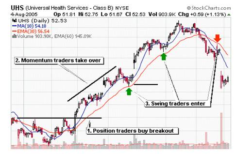
Now you can see where you fit
into the big picture of this animal we call the stock market! Ok, I forgot to
mention the day traders that make up each of the individual candles but I think
you get the point.
Same Chart

On the chart above you can also see the traders action
zone which is the area in between the 10 sma and 30 ema. This is where
you, as a swing trader look for reversals back to the upside when going long
and reversals to the downside when shorting stocks. I've drawn arrows on the
chart to show where you get buy (green) signals and short (red) signals to
enter a stock. Pretty cool, huh?
It doesn’t matter whether you use sma’s or ema’s.
There is little difference between the two so don’t get caught up in the
variations. We are just using these moving averages to create a zone that we
will find our entries for long and short positions. We’ll cover the entries
(and exits) on a separate section of this site. I have found that for swing
trading, a lot of reversals happen in this area. So in order to create a focus
in your trading strategy, it is helpful to narrow down your potential stock
setups to one area on a chart. This zone provides a plethora of setups on a
daily basis.
We are not really concerned with the moving averages themselves. When a
stock pulls back into this zone, look to the left to identify support and
resistance, trend lines, candlestick patterns, etc. You are looking for
multiple signals all pointing in the same direction.
Will this strategy make me a profitable trader?
You may be surprised by my answer.
The answer is no.
There isn't ANY trading strategy that will make you a
consistently profitable trader. Sorry to disappoint you.
The only thing that will enable
you to consistently pull money out of the markets is YOU. YOU must have
discipline. YOU must be able to take losses. YOU must be able to take your
profits. YOU must eliminate fear. Put simply, you must be able to control the
emotional and psychological problems that prevent success. That will
be your biggest challenge in learning how to trade stocks with any strategy… so
start early.