We often think of a prediction as a single scalar (or vector) value that the model predicts will be the output from a given input. In fact, the prediction from a regression model is a probability distribution on the values that could be output. The single prediction we are used to seeing is just the mean of that distribution. The distribution is a a t distribution (see a statistics text for a description of t distributions).
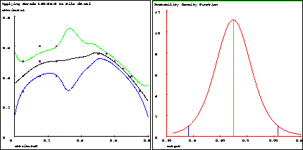
Figure 19: a) Fitted 1-d function with confidence intervals, b) Distribution of
output variable at input query 0.15
When regression is used to fit a model, the result is a multi-dimensional t distribution on all the coefficients of the model. The t distribution for the output is found by making a projection from the joint distribution on the coefficients. The projection is based on the attribute values of the input query.
Now, we'll use Vizier to see what confidence intervals look like on a small, 1-d data set:
File -> Open -> d4.mbl
Edit -> Metacode -> Regression   L: Linear
                    Localness    4: Very local
                    Neighbors    0: No Nearest Neighbors
Model -> Graph -> show_confidences ON
               -> Graph
Fig. 19a shows a graph similar to what Vizier produces (later we'll see how to make them look exactly alike). The middle curve is the predicted function given the data points. The other curves are the upper and lower confidence intervals on the function. That means that for each input point, we expect the true mean output to lie outside the range between the upper and lower curve only 5% of the time. In all cases, the predicted function lies exactly between the upper and lower bounds. There are several things that affect the width of these confidence intervals. On the left side, the confidence intervals are wider because the data points show widely varying outputs at particular input values. In the middle, the confidence intervals are even wider because there is no data in that vicinity. Farther right, they are narrow because all of the data lines up exactly and has no noise.
We can also ask Vizier to show what the distribution looks like at a particular input point:
Edit -> Query -> ``input'' 0.15
Model -> Graph -> Dimensions 0
                  Graph
Fig. 19b shows the graph. Compare the horizontal axis in fig. 19b with the vertical axis values of the curves in fig. 19a at the input point 0.15. The prediction and confidence interval values match. Notice that the shape of a t distribution is similar to a normal (Gaussian) distribution.