Figure 1: Architecture
Steven F. Roth, John Kolojejchick, Joe Mattis, Jade Goldstein
School of Computer Science
Carnegie Mellon University
Pittsburgh, PA 15213-3890
(412) 268-7690
Steven.Roth@cs.cmu.edu
We present three novel tools for creating data graphics: (1) SageBrush, for assembling graphics from primitive objects like bars, lines and axes, (2) SageBook, for browsing previously created graphics relevant to current needs, and (3) SAGE, a knowledge-based presentation system that automatically designs graphics and also interprets a user's specifications conveyed with the other tools. The combination of these tools supports two complementary processes in a single environment: design as a constructive process of selecting and arranging graphical elements, and design as a process of browsing and customizing previous cases. SAGE enhances user-directed design by completing partial specifications, by retrieving previously created graphics based on their appearance and data content, by creating the novel displays that users specify, and by designing alternatives when users request them. Our approach was to propose interfaces employing styles of interaction that appear to support graphic design. Knowledge-based techniques were then applied to enable the interfaces and enhance their usability.
KEYWORDS: Graphic Design, Data Visualization, Automatic Presentation Systems, Intelligent Interfaces, Design Environments, Interactive Techniques
Graphic displays of information have been valuable for supporting data exploration, analysis, and presentation. Still, current graphics packages remain very limited because: (1) they do not provide integrative displays for viewing the relations among several data attributes or data sets, (2) they have time-consuming and complex interfaces, and (3) they provide little guidance for the majority of users who are not experienced graphic designers.
Consider these problems in the context of two graphics in Roth Color Plate 1. In 1a, a sequence of indented text, charts, and a table are aligned to integrate six attributes of activities (organization, start, end, status, cost, resource).
All information about a single activity can be obtained by glancing horizontally across the graphic. Most packages do enable users to create charts and tables like these, but only as isolated displays. Even painstaking cutting, pasting, and resizing (usually the only means provided) are insufficient to layout and sort the bars and text in a coordinated way.
Similarly, current packages provide no way to create a single display with different graphical objects. In 1b, properties of lines, text strings and diamond-shaped marks vary to integrate ten data attributes. Also, graphical objects are clustered to express facts (i.e. each diamond is accompanied by two text labels to convey the geographic location, city, and date of battles). Together, these graphics illustrate the large number of possible combinations of object types, their graphical properties, the encoding spaces in which they occur (e.g. within a chart, map, table, or network), and the different ways they can be clustered and aligned. Clearly, current menu-style interfaces in spreadsheet packages would not support the creation of so many alternatives, nor could they help users assign data attributes to these graphics easily. Imagine the difficulty of conveying the relationship between data in spreadsheet columns and all the graphical objects and properties in 1b.
Furthermore, imagine the considerable design expertise required of users to produce these displays, including an awareness of the appropriateness of graphic choices for each data type. Even when users can judge the effectiveness of a particular display of their data, they often lack exposure to the many types and combinations of graphics that are possible. Systems that provide the ability to create new integrative designs will need to provide design guidance as well.
One approach to these problems is to build systems that are knowledgeable of graphic design, so they can generate a variety of effective displays based on descriptions of data and viewing goals [1,3,4,9,10]. This research has provided a vocabulary for describing the elements of graphics, knowledge about the appropriateness of their use for different data and tasks, and design operations for combining elements to form integrative displays.
Armed with this knowledge, automatic design systems should reduce the need for interaction and expertise, while providing great flexibility in customizing displays. However, previous automatic design research has not been concerned with supporting interaction with users and has focused on issues of identifying and encoding knowledge of data, tasks, and design. No paradigms have been developed for a collaborative process between human and automated designers.
This paper describes a novel approach to interactive graphic design, in which automatic mechanisms are used to support users, not replace them. The following sections describe an overview of our approach, two major components of the system that correspond to two complementary styles of design, and some sample design interactions which illustrate these capabilities.
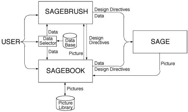
Our approach to supporting design has been to integrate an evolving automatic presentation system called SAGE [9,10] with two new interactive design tools called SageBrush and SageBook. Both tools enable users to manipulate familiar objects in order to perform natural design operations, shielding users from the more complex representations and operations that SAGE uses to create graphics.
SageBrush (also called Brush) is representative of design tool interfaces in which users specify graphics by constructing sketches from a palette of primitives and/or partial designs. Our goal is to provide a flexible, generative, direct manipulation design interface, in which users can create a large number of possible combinations of graphical elements, customize their spatial and structural relationships, and map them to the data they wish to visualize.
SageBook (also called Book) is an interface for browsing and retrieving previously created pictures (i.e. complete, rendered designs) and utilizing them to visualize new data. Book supports an approach to design in which people remember or examine previous successful visualizations and use them as a starting point for designing displays of new data, extending and customizing them as needed. Our experiences in graphic design, as well as related research on engineering and software design [2,6], suggest that search and reuse of prior cases with customization is a common process. Therefore, our goal is to provide methods for searching through previously created pictures based on their graphical properties and/or the properties of the data they express. A picture found in this way can optionally be modified in Brush prior to sending it to SAGE, which creates a graphic for the new data.
SAGE is an automatic presentation system containing many features of related systems like APT, BOZ, and ANDD [1,3,4]. Inputs are a characterization of data to be visualized and a user's data viewing goals. Design operations include selecting techniques based on expressiveness and effectiveness criteria, and composing and laying out graphics appropriate to data and goals. A detailed discussion of automatic design capabilities, including the operations that produced Roth Color Plate 1a, can be found elsewhere [7,9].
The current version of SAGE goes beyond previous systems in several ways. SAGE can create graphics when users completely specify their designs as well as when they provide no specifications at all. Most importantly, it can accept partial specifications at any level of completeness between these two extremes and finish the design reasonably. User specifications serve as design directives, which constrain the path of a search algorithm that selects and composes graphics to create a design.
The ability to accept partial specifications from Brush is due to a rich object representation of the components of graphic displays, including their syntax (i.e. their spatial and structural relationships) and semantics (i.e. how they indicate the correspondence between data and graphics). The representation allows SAGE to produce combinations of a wide variety of 2D graphics (e.g. charts, tables, map-like coordinate systems, text-outlines, networks). It also enables SAGE to support Book's search for previous pictures with graphical elements specified by users.
The object representation is highly extensible, allowing new graphical objects (e.g. lines, polygons, custom icons) and encoder mechanisms (e.g. charts, color keys, maps) to be added incrementally. For example, when a line object is added to the library, each end-point is defined as having horizontal and vertical positions, enabling the line to be displayed against the axes of a chart. If a map-style is later defined in the library as an encoder that displays horizontal and vertical positions, then SAGE can automatically draw lines on maps (as in Roth Color Plate 1b).
SAGE also contains a richer representation of the characteristics of data (e.g. distinguishing scales of measurement, temperature, dates, spatial coordinates, etc). Data transformation operations enable the design of graphics without depending on the surface form of input data (e.g. in relational database terms, SAGE can display N-ary relations and is not dependent on whether data is expressed as multiple binary relations or as a single N-ary relation).
Figure 1 illustrates the conceptual relationships among SageBrush, SageBook, SAGE, and a Data Selector - a tool for indicating the mapping between data and graphics. The process of retrieving data needs to be integrated with graphic creation but is not the focus of this paper. We are exploring several interactive methods for retrieving and transferring data to the selector, where data appears as a table whose headers can be mapped to graphics (Figure 2).
Users interact with Brush to create graphic design sketches, which are schematic views of designs. These are translated into design directives, which are specifications expressed in SAGE's graphic representation language. Directives include:
Design directives from Brush serve two purposes: they guide SAGE's automatic processes and provide criteria for Book to use in searching its library of previously designed pictures. Brush can also translate graphics produced by SAGE back into sketches so that users can modify them.
Users interact with Book to view and save pictures created by SAGE. The saved information includes a bit map scaled to a browsable size, a sequence of design operations that SAGE can use to reconstruct the picture efficiently (i.e. without redesigning), the picture's data and data type characteristics, and a complete representation of the rendered graphic. Book searches its picture library based on data users specify with the Selector and/or design directives derived from sketches created in Brush's work area (Figure 2). Users request the creation of a graphic based on a previously found one by transferring it to Brush (where they modify it as a sketch) or directly to SAGE. The next sections describe these components in detail.
Brush is representative of tools with which users sketch or assemble graphical elements to create designs and map them to data. Brush provides users with an intuitive and efficient language for sketching their designs, and translates these sketches into a form that can be interpreted by SAGE. There are other possible styles of graphic design interface that could be coordinated with SAGE's internal design mechanisms. One alternative is the demonstrational approach proposed for Gold [5], in which users draw examples of displays. Our claim is that any interactive design interface that attempts to provide complete coverage of graphics will require a knowledgeable system behind it to be successful.
An example: Figures 2, 3, and Roth Color Plate 1b illustrate a sequence for creating a new version of the famous graphic by Minard showing Napoleon's 1812 Campaign [11]. One data set describes the march segments (start and end latitudes/longitudes of each segment, the number of troops remaining, and the temperature). The other data set contains the city, date, and location of each major battle. These will be visualized by composing multiple graphemes and their properties on a map.
Anchoring new designs with partial prototypes. The creation of a new design begins with a user's selection of a partial prototype. As illustrated in Figure 2, Brush's interface consists of a design work area (center) into which users drag prototypes (top), graphemes (left), and data names (bottom). Prototypes are partial designs, each with a spatial organization, graphemes, and/or encoders that commonly occur together. Encoders are frames of reference for interpreting properties of graphemes. For example, axes enable us to interpret (i.e. derive a data value from) the position of a bar in a chart.
The choice of prototypes to include in the top menu can be customized to applications and could include previously designed graphics. Although primarily a constructive interface, Brush still allows design to be viewed as a process of refining prior, effective graphics. The first prototype in the top-left of Figure 2 is a general one for constructing all charts. It is actually a composite of horizontal and vertical axes. Although users could construct charts by assembling separate axes, doing so requires more steps and appears less intuitive than selecting a chart prototype. A similar rationale led to a network prototype, consisting of both graphemes (i.e. lines) and an encoder against which the graphemes are interpreted (i.e. the nodes). This eliminates the need for users to construct networks from primitives each time. In the example, a map prototype (more precisely, a 2D spatial coordinate display) was dragged to the design work area.
Customizing by adding primitives to prototypes. Prototypes are extended by adding graphemes. While the chart and map prototypes have no graphemes, dragging them into the design work area creates an encoding space which supports new design choices. The encoding space of a chart or map is defined by the interior of the two axes or coordinate-frame, respectively. Dragging line and mark graphemes (to represent march segments and battles) from the left window into the map's encoding space results in directives to SAGE to include these grapheme types in a design, with their positional properties interpreted relative to the map's coordinate system.
Customizing the properties of graphemes. Graphemes have other properties for encoding data besides position. Properties are chosen by selecting property icons, displayed by double-clicking a grapheme in the design work area. Double-clicking on the line in Figure 3 displays a menu of line properties (width and color) and arrows representing the positional properties of end-points. Selecting a property directs SAGE to use it to encode data in a design but does not indicate the data to which it corresponds. Double-clicking on a property icon allows users to convey specific directives (e.g. make all marks diamond-shaped or all lines blue; reject the use of color).
Completing the graphic requires a way to create grapheme clusters. As described above, dragging graphemes into an encoding space results in directives to use their positional properties in a design. When two or more graphemes are dropped close together in the same space, the position of one is interpreted relative to the axes or coordinate system, while the positions of others are interpreted to convey association by adjacency. In Figure 3, two text strings have been placed next to the mark (which has been customized to be diamond-shaped) to convey association. Note that Brush only determined that the two strings and diamond are associated. SAGE must infer which of the three is used to convey position in the coordinate system (using knowledge of data characteristics and graphic expressiveness criteria [8,9]). Of course, a user can explicitly double-click on the diamond and select its property icons for position (a pair of arrows).
Communicating the mapping of data to graphics. Dropping a grapheme in a chart and selecting its color result in directives to SAGE to generate a design where position and color encode data. It does not specify which data (i.e. relation domains) to assign to these properties. While SAGE could attempt to infer this (just as it could also make choices of graphemes and properties), users can explicitly make these choices by dragging data labels from the Data Selector (bottom Figure 2), and dropping them on property icons. In Figure 3, Troop Size was mapped to line thickness and Start Latitude and Start Longitude to the position of one end of the line. Battle and Date have been mapped to text labels adjacent to the diamond (dragging a data name into the space simultaneously specifies that a text grapheme be used and maps the data to it). The completed design resulting from this interaction is shown in Roth Color Plate 1b, which was generated by SAGE.
Coordinating multiple design spaces. In addition to defining encoding spaces, prototypes also define layout spaces, which enable users to specify the relative positions of prototypes with respect to each other. There are two types of layout spaces, reflecting adjacency and embedding relationships. Adjacency spaces enable horizontal and vertical alignments among charts, tables, maps and other prototypes. Two charts and a table in Figure 5 have been sequenced by placement adjacent to each others' layout spaces. Embedding spaces enable the placement of one prototype within another (e.g. a network placed within a map or chart; a list placed within a network node).
Finally, it is important to emphasize that all of these design choices are optional. Users only need to specify the data they wish to visualize, but may further specify (to any level of completion):
The goal of Book is to provide users with the ability to create new pictures analogous to existing ones they consider useful. Our intent is to provide users with access to a growing portfolio of graphic designs to provide ideas for visualizing their data. Book capitalizes on the explicit representation of designs and data characteristics by SAGE to provide a vocabulary for expressing search criteria.
Book provides two mechanisms for browsing pictures. The first is a file-folder metaphor analogous to that used in the Macintosh system, in which pictures created by SAGE are named and stored in locations defined by users. The second mechanism provides browsing by two types of picture content: graphical elements and data. Search criteria are based on exact match or partial overlap with data in the Data Selector and/or design elements in Brush.
Figure 4 illustrates the interface for browsing pictures retrieved by a search based on data overlap. The data for the search were facts about activities in a project management database (the final picture is shown in Roth Color Plate 1a). Pictures in the library that expressed similar data were listed by the interface. As a user selects each picture name, its bitmap is displayed. Multiple full size pictures can be displayed and arranged by users for comparison.
We have designed search criteria for several levels of match overlap based on data. These involve retrieving pictures which:
SAGEBRUSH

Figure 2: Starting a design sketch in SageBrush.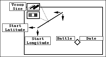
Figure 3: Property selection and data mapping in SageBrush's work area.
The Napoleon example illustrates that users needn't specify all mappings. The system inferred End Latitude, End Longitude, and Temperature (and could have made choices for the other data, possibly differing from those of the user). The strength of this approach is that it can (1) reduce the amount of work needed to convey design choices and map them to data, (2) enable the construction of composites that could not be created by menu-based approaches, (3) provide design expertise to supplement that of users, and (4) provide design directives for SageBook to use in searching its library of previously constructed pictures.
SAGEBOOK
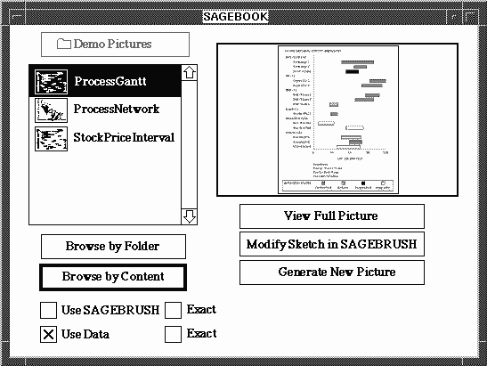
Figure 4: Browsing graphics by their data content in SageBook.
For example, a data relation (to use relational database terms) representing quarterly expenses for a company's departments (Department, Business Quarter, Operating Cost) may have the same properties as another relation for stock market data (Stock, Calendar Date, Shares Traded). Both relations contain three domains with identical data characteristics: a nominal type, a temporal coordinate, and a quantity. There is also exactly one quantity for each nominal-time pair in both relations (i.e. functional dependency). See [8] for a more complete treatment of data characterization relevant to graphic design.
We have designed search criteria for several levels of match overlap based on graphical elements as well. These involve retrieving pictures that (1) show exactly the same design elements as those in the Brush sketch and (2) contain the Brush elements as a subset of a more complex design.
Our current work is addressing the problem of defining match criteria for combinations of data and graphical properties. We are also exploring similarity criteria for defining close matches with partial overlaps. For example, we need criteria for determining whether a network where the color of links encodes data is more similar to a chart using the color of bars or to another network where the widths of links encode data (i.e. what graphical elements are salient to users). Our intuitions suggest the latter, but a cognitive model based on user studies is needed to define similarity, as well as to verify the appropriate graphical primitives for the Book and Brush interfaces.
Our preliminary view is that searches based on different criteria serve different purposes for users, including:
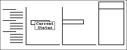
The last case is illustrated in Figures 4 and 5. Book found an indented chart with color-coded interval bars for data matching only part of a large data selection (activity, organization, start, end, current-status, labor-cost, resource). The chart was converted to a sketch in Brush, and the user added a bar chart and table aligned with the original interval chart. The user also mapped Current-Status to the interval grapheme, leaving it to automatic mechanisms in SAGE to map it to color (because the original picture used color). SAGE can automatically assign Activity to the Y-axis, dates to the interval bar, and Labor-Cost to the horizontal position of the bars in the added chart, based on expressiveness rules for these graphical properties. The resulting picture is shown in Roth Color Plate 1a. SAGE integrated all design elements and determined appropriate data mappings. Notice that Resource is placed in the table, while Organization is placed in the indentation of the Y-axis...an arbitrary choice that a user can easily reverse. The operations that produced Roth Color Plate 1a can be found in [9].
Our approach views the task of creating visualizations of data as a combination of two interrelated processes:
Another central theme of our approach is the use of automated design knowledge in SAGE to provide new display capabilities, to enhance the usability of graphic design interfaces, and to provide design expertise when needed by users. These are realized in several ways.
First, SAGE enables users to create a wide variety of integrative displays, which coordinate multiple spaces, graphemes, and visual properties to show the relationships among several data attributes or data sets. This is possible because SAGE recognizes and parses the structure and semantics of sketches that users construct.
Second, knowledge enables a system to automatically design a graphic when requested by users. This can occur when users do not know how to represent data (i.e. they lack expertise in general or for a specific problem) or when they want to compare alternative designs with the ones they have created.
Third, SAGE reduces the work of designing a graphic by completing it automatically when partially specified. This often eliminates the need for users to assign data to elements of the graphic, select graphical properties once objects are specified, or perform other repetitive selections.
Fourth, SAGE makes it possible to search displays created previously based on meaningful criteria: the data and graphic elements they contain. Without this knowledge, Book would be limited to browsing graphics based on file attributes.
There are many research problems remaining, especially for supporting users with limited graphics expertise. First, the operation of any automatic presentation system depends on the existence of data characterizations [8]. In this research, data characterizations were already present in the database or spreadsheet. We will be exploring ways to infer them or obtain them interactively.
Second, although SAGE considers user information-seeking goals or tasks [1,8,9], no attempt was made to provide users with the ability to specify these. We are considering creating a goal-selection interface so users can convey their intentions as design directives.
Finally, there are numerous new graphic design problems to address, including the design of interactive mechanisms for manipulating data displays, displays of large data sets, and graphical techniques such as animation and 3D. See [7] for a more complete discussion of research problems in this area.
1. Casner, S. M. A Task-Analytic Approach to the Automated Design of Information Graphic Presentations. ACM Transactions on Graphics, 10, 2 (Apr. 1991), 111-151.
2. Fischer, G. Cognitive View of Reuse and Redesign. IEEE Software, (July, 1987), 60-72.
3. Mackinlay, J. D. Automating the Design of Graphical Presentations of Relational Information. ACM Transactions on Graphics, 5, 2 (Apr. 1986), 110-141.
4. Marks, J. W. Automating the Design of Network Diagrams. Ph.D. thesis, Harvard University, 1991.
5. Myers, B. A., Goldstein, J., and Goldberg, M.A. Creating Charts by Demonstration. Proceedings SIGCHI'94 Human Factors in Computing Systems, Boston, MA, ACM, April, 1994.
6. Navin-Chandra, D. Exploration and Innovation in Design: Towards a Computational Model. Springer-Verlag, 1991.
7. Roth, S. F. and Hefley, W.E. Intelligent Multimedia Presentation Systems: Research and Principles. In Mark Maybury (Ed.) Intelligent Multimedia Interfaces, AAAI Press, 1993, pp. 13-53.
8. Roth, S. F. and Mattis J. Data Characterization for Intelligent Graphics Presentation. Proceedings SIGCHI'90 Human Factors in Computing Systems, Seattle, WA, ACM, April, 1990, pp. 193-200.
9. Roth, S. F. and Mattis, J. Automating the Presentation of Information. Proceedings IEEE Conference on AI Applications, Miami Beach, FL, Feb. 1991, pp. 90-97.
10. Roth, S. F., Mattis, J., and Mesnard, X. Graphics and Natural Language Generation as Components of Automatic Explanation. In Sullivan and Tyler (Ed.), Intelligent User Interfaces, Addison-Wesley, Reading, MA, 1991, 207-239.
11. Tufte, E. R. The Visual Display of Quantitative Information. Graphic Press, Cheshire, CT, 1983.
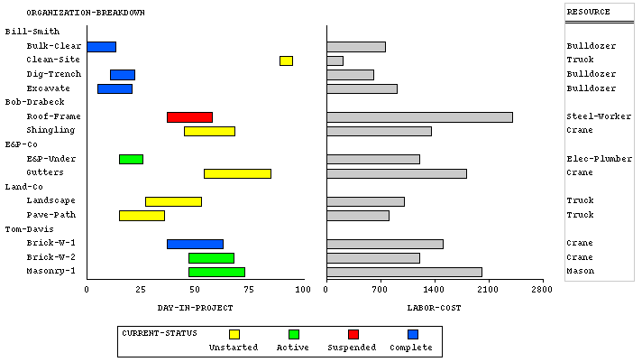
Color Plate 1a: Result of a SageBrush customizaton of a picture retrieved using SageBook. Six data attributes are integrated in a coordinated set of aligned displays that illustrate project management data.

Color Plate 1b:
"Napoleon's 1812 Campaign", designed interactively using SageBrush. In all, ten data attributes are integrated in a single map-like coordinate space using several kids of graphical objects. The lines trace the path of Napoleon's eastward advance and westward retreat, including the path of troops that branched north to protect his main force. Line thickness conveys the number of troops traveling each segment, line color conveys the temperature, and the dates and sites of battles are signified by yellow diamonds and text.
Napoleon's eastward advance began in extreme heat, with the weather cooling as he approached Moscow (bright red at left fading to pink at upper right). During the westward retreat, the army circled back to retrace its route while the temperature dropped below freezing (the light blue segments overlying the red path). Upon reaching Krasnyj, the army veered south from its previous route. When the march ended, less than three percent of Napoleon's troops remained, as shown by the striking decrease in line thickness.

Sean Cier (scier@cmu.edu)
Last update: 4 December 1995