Figure 1: Drilling down organizationally
Steven F. Roth*, Mei C. Chuah*, Stephan Kerpedjiev*, John Kolojejchick*, Peter Lucas**
*Robotics Institute
School of Computer Science
Carnegie Mellon University
Pittsburgh, PA 15213
412-268-7690
**MAYA Design Group, Inc.
2100 Wharton Street
Pittsburgh, PA 15203
412-488-2900
There is a growing need for people to make use of information-intensive systems as organizations invest substantially to build and maintain databases to support their activities. This is true in almost every domain, including areas such as management (e.g., hospital, school, factory, project), research and analysis (e.g., marketing, sales, investment, accounting), event tracking (e.g., product inventory and distribution), and planning (e.g., transportation and communication resources).
As people attempt to make use of these information resources, challenging user interface design problems are emerging. These result not only from the abstract nature and large quantities of information they must consider, but also because of the diversity of tasks they must perform in the course of working with this information. Sometimes a user's task is to retrieve individual facts to answer focused questions (e.g., the quantity of parts in a warehouse). More often, users' tasks are exploratory and iterative. The results examined at each step determine questions to pursue next. The character of these tasks is reflected in the terms researchers have used to refer to this work: exploratory data analysis (Tukey, 1977), data mining (Holsheimer & Siebes, 1994), data archaeology (Brachman et al., 1993), and data exploration (Goldstein et al., 1994). Usually, exploration is just the beginning: people must also communicate and act on information.
Therefore, effective environments will provide user interface mechanisms that support multiple information analysis tasks. For example, the process of understanding traffic accident data might include tasks such as:
Information visualization has become a popular research area for addressing these problems. The design goal has been that of creating concrete, external, manipulable objects to enable people to perform tasks whose abstractness, complexity, or magnitude make them very difficult to perform otherwise (e.g., when they are represented textually). Typically, the goal of visualization research has been to enable people to perceive relationships and manipulate data sets using more efficient perceptual and motor operations instead of performing many more demanding cognitive operations (Casner, 1991). Some of this work has been on new graphical representations and direct manipulation interaction techniques (e.g., Chuah et al., 1995b; Goldstein et al., 1994; Rao & Card, 1994). Other work has assembled techniques to produce focused tools or applications (e.g., Eick & Steffen, 1992; Plaisant et al., 1996; Spence et al., 1995). Still other work has addressed the problem of enabling users to create visualizations dynamically, as they are needed for analysis (e.g., Gray, Waite, & Draper, 1990; Roth et al., 1994).
However, little research has been done on the broader problem of supporting the wide range of information search, analysis, communication, and system control tasks within a single user interface environment. This includes understanding how to create a consistent information workspace where people can make seamless transitions in their use of multiple visualizations, tools, and applications. The first goal of this paper is to present our work on the design features we have explored in creating a workspace called Visage. This will include our related research on visualization and interaction techniques that are being integrated within the Visage environment. The paper will discuss:
A central element of our approach is to provide people with multiple means for expressing their intentions while performing tasks. By multiple means of expression, we are referring to interaction techniques that are effective for different purposes but often useful in combination because they support representations of different kinds of goals, actions, and objects.
Multimodal interfaces are a good example of interfaces that provide multiple, complementary ways for people to convey their intentions. Oviatt (1996) studied people interacting with information in geographic displays and found that multimodal interfaces (combining speech and pen inputs) are more effective than interfaces using a single input modality. Speech inputs are better for retrieving objects that could be identified by referring expressions (e.g., by their names or with descriptions of groups) especially when they are not already visible. In contrast, pen input is more effective than speech for specifying spatial regions on a map and for pointing to objects that are not easily named or described linguistically. Tasks involving both these actions are performed most effectively with multimodal interfaces.
This research demonstrates the importance of characterizing the different means by which people most effectively express their intentions in information-intensive workspaces. Such a characterization would help determine when different input channels are effective individually and in combination. More generally, however, it would enable us to understand when multiple interface techniques should be combined - whether or not they use different input channels. Although current work on information visualization and exploration has been unimodal (i.e. using direct manipulation), it has sometimes addressed the need for interfaces that support multiple means of expression by combining multiple interface styles and techniques. There are also numerous opportunities for enhancing the usability of these systems with multimodal interfaces (i.e. adding speech).
The second goal of this paper is to explore some dimensions for characterizing different means of expression that are particularly relevant to the design of information visualization environments. We will use these dimensions to discuss both the successes and shortcomings of direct manipulation interfaces we have developed using individual and combinations of different means of expression. We will also point out opportunities where multimodal approaches (particularly speech and direct manipulation) are likely to be successful.
In the next section, we discuss several dimensions for analyzing user interfaces that characterize how they enable users to express their intentions in information visualization environments. We will use these dimensions to evaluate three areas of research we have been pursuing. Section 3 presents our work on Visage, an information workspace. Section 4 presents our work on SAGE, a visualization system that has been integrated with Visage to provide graphical depictions of data. Section 5 presents our work on a prototype called SDM for manipulating the appearance of visualizations interactively. At the end of each section, we discuss how the user interfaces provide multiple means by which users can express their intentions. We also discuss limitations of these interfaces and the potential advantages that might be provided by adding multimodal interfaces (speech and direct manipulation).
We have identified four dimensions that emerged repeatedly in our design of interfaces for visualization and information exploration workspaces. These are not complete and are intended as a starting point for understanding contexts in which one or multiple user interface techniques and/or modalities are appropriate. They are related to dimensions discussed by Cohen and Oviatt (1995) for speech and direct manipulation interfaces. Each dimension characterizes a continuum of ways of communicating with a system to perform information exploration tasks:
Set Description. The firstc dimension refers to the process by which a user conveys objects on which to work. It roughly corresponds to whether sets of interest are defined by enumerating their members (i.e., the set extension) or by explicitly defining the criterion for inclusion (i.e. the intension of the set). Expressing the intension of a set requires being able to articulate the attributes and ranges of values of objects that define group membership. There are many examples of interfaces for this in database query applications (e.g., query command languages, form-filling interfaces, natural language speech input, and direct manipulation controls such as dynamic query sliders (Ahlberg & Shneiderman, 1994; Ahlberg & Wistrand, 1995). All of these might be used to define a set of houses to be retrieved from a real estate database (e.g., ²find houses that cost between $200,000 and $300,000²). No particular house is named, just a description defining membership.
At the other extreme of this dimension are situations in which it is not easy to create an expression that refers to all the objects of interest (e.g., when there is no simple attribute-value range that defines set membership). Specifying a cluster of houses located in an irregular region on a map is one example (Oviatt, 1996). A similar example is describing a subset of points in a chart, where distributions of quantitative variables cause some sets of objects to be of interest. For example, a chart showing house price vs. house size may reveal clusters of houses whose prices seem somewhat lower than the majority with similar sizes. These sets may be more easily defined by enumerating (e.g., pointing) than by creating a descriptive query.
Granularity and composibility of actions. This dimension is intended to differentiate contexts in which a user performs a task either by selecting and composing a set of primitive operations or conveying a more abstract operation or goal in a single nondecomposable expression. Expression of intent through selection and composition of primitives may be associated with contexts in which there is a large number of possible actions. It is therefore hard to anticipate each possible action and assign a unique interface choice (e.g., menu item or linguistic expression). Conversely, contexts in which one can anticipate a small set of frequently performed tasks permit designers to create custom appliance-like interfaces in which small adjustments can be made through a single interface.
An analogy illustrating this tradeoff between composition of simpler tools vs. appliance-like devices is the difference between making bread using an automatic bread-maker compared to kitchen tools for mixing, kneading, and baking. The former is a single-purpose appliance (i.e. it can't be used to prepare soup) and as a result, it only needs a few controls to change its specialized operation (e.g., for different ingredients and taste preferences). In contrast is the larger set of simpler tools (knives, cutting boards, bowls, mixers, pans, oven utensils, etc.) that are reusable in different combinations for other purposes.
Form interfaces tend to be more like appliances, while query languages tend to me more like composable tools. Speech input might be used to support either, depending on the level of granularity of the actions that can be interpreted. One could imagine a speech act that is the equivalent of "make me some bread" or a lengthy series of utterances that details every step of a recipe.
Continuity of action. At one extreme this dimension is intended to characterize contexts in which a user is producing change in the behavior or appearance of a system by adjusting parameters and obtaining feedback dynamically. An example is adjusting the color or brightness of a monitor, or the zoom of a map display until it is sufficiently readable yet not so big as to force important detail out of view. Expression of intent in this manner is a process of successive approximation. At the other extreme are contexts in which the change is discrete, requires little feedback because the result of the expression is known in advance, and is obtainable in a single step. Examples are hiding or deleting objects on a desktop and requesting folders to be sorted by date. Whereas adjusting a lamp dimmer switch to the appropriate intensity is a process of conveying continuous change with feedback, picking a television station by entering a number on a keypad is an example of a discrete expression.
Consistency with domain vocabulary. This dimension is intended to reflect how familiar people are with the vocabulary used to describe objects and actions in an interface environment. This often corresponds to whether people can express their intent using vocabulary they ordinarily use in their work. This is particularly relevant for data exploration, where the process of obtaining an effective visualization may require communicating about elements of graphic design that are unfamiliar and not easily expressed by people in other disciplines. Likewise, people often develop vocabularies for referring to particular types of information, analyses or report formats and these can serve as vocabularies for expressing their requests within an interface. This dimension reflects whether the means of expression provided by the interface is one that can rely on existing domain vocabulary and if not, how the application creates a new vocabulary or avoids the need for one altogether.
In summary, we describe these dimensions to guide our discussion of some key interaction issues in information visualization and exploration environments. The main point is that these environments require combinations of interface techniques to provide people with multiple means of expression with which to communicate their intentions. Thus far we have attempted to address these needs with multiple direct manipulation techniques. Many of these requirements will be better served by multimodal interfaces providing speech inputs as well. The remainder of this paper will present an overview of this work and highlight these issues.
The need to support a wide variety of basic information manipulation and analysis tasks has given rise to many new techniques, visualizations and applications. These are often specialized to a particular subset of tasks. For example, some applications support creating new data attributes and visualizing relationships among them. Others support controlling the level of aggregation of data and rapid filtering of data subsets. Still others support navigation through large data spaces. A fundamental user interface design question is how can we use the complementary features of different visualization and analysis tools in a coordinated and uniform way? Even for just these few example operations, how can we create new attributes with one tool, filter the same data with another, and visualize the resulting subsets with a third?
One approach to this problem is to create an information exploration environment that contains a relatively complete set of basic operations that every application implemented within it can draw upon. This approach to uniformity has been successful in current graphical user interface environments, which have consistent methods for cutting, pasting, printing and saving information in most applications.
However, custom applications will still be needed to address specialized information analysis needs that cannot be satisfied by basic operations in the environment alone. For example, in domains such as transportation scheduling and tracking (which we have been using as a test case), analysts use one system to generate and display airplane schedules, another for tracking the location of cargo in transit, and a third for managing warehouse inventory and requisition handling. The interfaces to these applications each have useful visualizations but no mechanism to explore relationships among the different data they portray. For example, there is no way to explore the relations among the locations where supplies are stored, the people who order them, and when they are scheduled to be shipped by air.
The question then is what user interface approach would enable people to easily move and combine interesting subsets of information across the isolating boundaries imposed by different applications? These problems suggest the need for a user interface environment for people who work in information-intensive domains - an electronic workspace for people who explore and analyze large amounts of data daily. Such a workspace must provide several key capabilities.
First, it requires user interface techniques that enable information to be selected and combined from multiple application interfaces, visualizations, and analysis tools.
Second, it must enable rapid generation of visualizations to integrate information from these diverse sources. The value of integrative visualizations is obvious. However, because the combinations of information that people will create are often unpredictable, it is not possible for software developers to create every visualization in advance. Therefore, an effective workspace must provide tools by which users can create new visualizations as needed without great effort or skill.
Third, consistent user interface techniques are needed with which people can filter, control level of detail, navigate, and create new information wherever it is displayed.
Fourth, an effective environment should make it easy for people to share and communicate their results in collaborative settings, where they must iterate between analysis and presentation activities frequently.
In order to address these needs, we are developing an approach within an environment called Visage. Our goal is to incorporate basic information exploration operations within a user interface paradigm that also coordinates multiple application interfaces. The remainder of this paper provides an overview of Visage and a discussion of some of its key component technologies. Visage's main components include:
An information-centric user interface paradigm. As the name implies, this paradigm strives to provide users with greater direct contact with objects that represent information they need to view and manipulate to perform their work. In this paradigm, information is represented as first-class objects that can reside and be manipulated in visualizations, application user interfaces, on desktops, in briefing materials, or anywhere else people elect to place it. It is ultimately concerned with usability (i.e. it is user-centered), in that it seeks to reduce the complexity and restrictions created when people cannot access information directly and instead must face the mechanics of running and coordinating applications and working with file system metaphors. One of the important outcomes of this approach is a basic UI operation of directly moving information across user interfaces.
Interactive information manipulation. These include tools for:
Dynamic visualization generation. In order to provide integrative views of information, we are incorporating within Visage our work on SAGE (Chuah et al., 1995a; Chuah, Roth, & Kerpedjiev, 1997; Roth, 1996; Roth & Mattis, 1990, 1991; Roth et al., 1994), a knowledge-based automatic graphic design tool. This approach provides rapid generation of visualizations customized to users' immediate data exploration tasks. We discuss SAGE after describing the main UI elements of Visage.
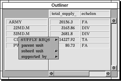
In order to convey Visage's basic styles of interaction it is useful to consider a detailed example. The example is based on one of the applications of this approach that we are pursuing to facilitate next generation logistics planning and tracking systems. These government systems are being developed to access and analyze information about the location, quantities, status, transportation, distribution, consumption and other properties of equipment and supplies and the people who need them worldwide. Logistical analysts help plan and track the amounts of all types of supply that military units need, help decide where supplies will be acquired, how and when they will be shipped, where local warehouses will be placed to support people that need them, how much local inventory to maintain, how to staff and schedule the trucking and material handling crews that will distribute the supplies, and continuously answer numerous questions that arise about arrival and location of equipment. Figure 1 illustrates an outliner style of table that is one of many informational displays we have created in the Visage environment. We refer to displays of information as frames (a term we discuss in detail later). The outliner frame is one way to provide a hierarchical perspective on tabular data and is useful for this example because it illustrates drill-down and roll-up capabilities in a familiar way. The same techniques are applicable to other approaches to displaying hierarchical data (e.g., Goldstein et al., 1994; Johnson & Shneiderman, 1991; Robertson, Mackinley, & Card, 1991).
Starting from any point in an object-oriented database for a logistics exercise, users are offered a menu of alternative dimensions along which they may drill down. In Figure 1, a user has already drilled down from an object representing the Army to its five subordinate units and has selected one division (the 53rd Division, which is abbreviated as 53MD.M) to drill down further by organization. The user accomplishes this by selecting the subordinate unit relation from a menu that is popped up via mouse control directly from the word representing 53MD.M. The result is a more detailed organizational breakdown, shown as blue-highlighted text in the outliner frame of Figure 2.
Figures 2-4
Figure 3
Figure 4
This drill-down process could also occur across different relations or links from any of these objects. For example, it is possible to drill-down from an object representing an Army unit to the equipment it possesses (e.g., trucks, generators, stoves). One could then drill-down further from one type of equipment to the parts or supplies it requires (e.g., from trucks to tires and engines) and then drill-down from one part- or supply-type to all the warehouses that have it in stock. This is a process of turning a network or web of database objects into a convenient hierarchical breakdown for analysis purposes.
On the right side of the outliner in Figure 1, users can select any attribute of the objects in the hierarchy that they want to have displayed, such as the weight of supplies a unit requires, its echelon, the number of people in the unit, etc. These attributes can be taken directly from the database or dynamically created as derived attributes using a scripting language. In either case, as the hierarchy is expanded, the values for these attributes are added with it. The dynamic drill-down and expression of attribute values is a fundamental operation in Visage that can occur in every frame.
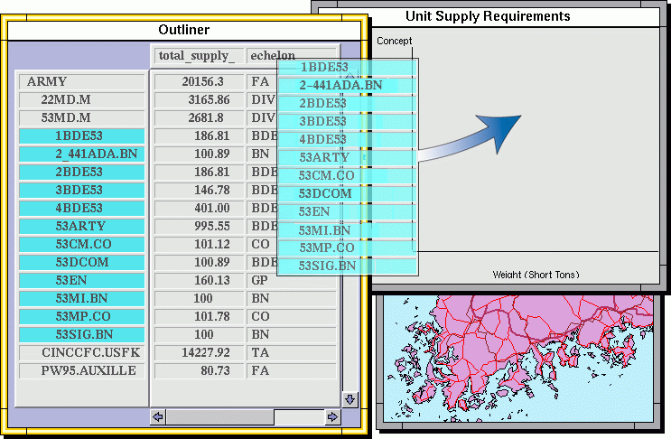
An important operation in our implementation of the information-centric interface approach is the ability to drag objects representing information among visualizations and application interfaces throughout the Visage environment. For example, in order to display graphically some of the attributes of the subordinate units of the 53rd Division, the user first selects those units by painting their names blue in an outliner frame. (Blue is one of several colors that can be chosen from a palette). After selecting the unit names, the user simply drags a copy of their visual representations into an empty bar chart frame, as shown in Figure 2. The "moving" units appear as blue translucent text in the figure.
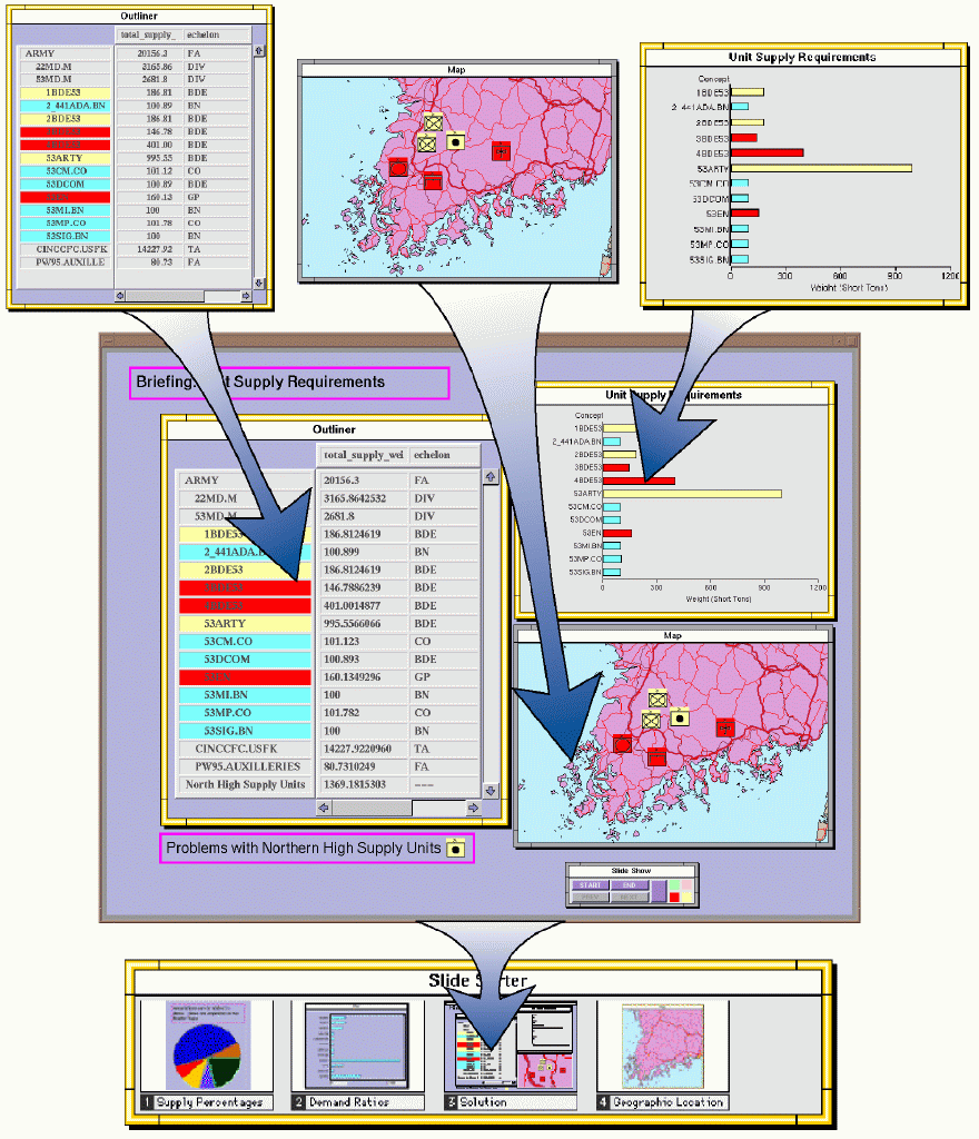
In this case, the bar chart visualizes the weight of supplies that each dropped unit requires as a bar, as shown in Figure 3 (see color plate 1). Each frame shows some attributes by default, or users can select other attributes from a menu attached to the frame. The menu of attributes is constructed dynamically from the objects that are dropped into the frame (i.e. the attributes of Army units in this example). Visualizing unit supply weights in a bar chart makes it easy to select those needing the most supplies - those with the longest bars. In Figure 3, the user has painted these bars red for subsequent copying and dragging.
It is now possible to check the locations of just these units on a map, perhaps to determine the locations where supply warehouses should be established to support them. Units are transferred to a mapping application with a similar drag and drop operation suggested by the translucent bars.
When placed on the map frame, the bars become military icons (a strict convention in this domain - each icon contains symbols conveying the type of unit and its organizational level). Scripts attached to each type of frame determine the way data objects are represented. The outliner uses text, the chart uses bars, and the map frame displays the longitude and latitude attributes of objects using military icons. Users can override some of these interactively, a feature we discuss in the section on SAGE. Three of the icons are already painted yellow in Figure 4 (see color plate 1) for a subsequent operation.
The map application is a product called MATT, which was developed independently of Visage by Bolt, Beranek and Newman and coordinated with Visage using its program interface. This is an example of one of the primary goals of our work - to explore how to cement together separately developed analysis tools into what the user will experience as an integrated work environment. MATT is used as a server of map images that are placed in Visage frames. All zoom operations, obtaining position information for placing objects on maps, and requests for additional map detail is performed through the MATT program interface. Graphical objects are drawn, painted and manipulated on this frame by Visage, thus enabling behavior consistent with other frames.
The map display can be used to further focus attention, for example, by painting yellow the subset of units that occur close together in the center of the map (perhaps to identify a region where large quantities of supplies will be needed). Notice that painting (Becker & Cleveland, 1982; Eick & Steffen, 1992; Goldstein et al., 1994; McDonald, 1990) an object in one frame causes it to be similarly colored in all other frames. Together, the three frames in Figure 4 show who the selected units are, the weight of the supplies they need, and where they are located. The blue, red, and yellow units are all subordinates of the 53rd Division. The red and yellow ones need the most supplies. Yellow ones are Northern units of special interest to a user and are dragged into the outliner.
In the last step of the example, this small subset of units can be rolled-up (i.e. aggregated) into a single object and named by a user, in this case, "North High Supply Units." It appears in the bottom of the outliner, and its attributes are the appropriate totals for the units it aggregates. The new aggregate can be treated as a single object for new drill-down operations. For example, it is possible to drill-down along a new dimension to the supply types needed by the aggregated units.
In summary, this example illustrates the most important aspect of Visage¹s information-centric approach: operations are directly applied to graphical objects representing information and not through the typical mechanics associated with running applications in current desktop environments (i.e. without performing export/import procedures that are the typical data sharing mechanisms used in spreadsheets and other tools). Applications created in this environment are invoked and coordinated by pulling frames out of pallets and dropping information on them. For example, the MATT program is run by pulling a map frame from a pallet and dropping graphical objects on it. Likewise, painting, drill-down and roll-up operations are all applied directly to objects that are coordinated across multiple applications via a shared underlying object representation.
This example can also be used to illustrate the characterization of communication we described in the previous section. It is worthwhile to briefly summarize its potential for understanding when multiple means of communication can be useful. We expand on this later, after a more detailed discussion of the Visage environment.
First, users requested information by composing a sequence of operations rather than by posing a complete abstract query in advance. Informational requests are specified through a series of drill-down, drag, paint, and roll-up operations. The means of communication here necessarily must be an incremental composition because the results of each step must be viewed prior to knowing the next place to focus. The last aggregate represents "units of the 53rd Division that need the 'most' supplies and are clustered in a small region to the north". No explicit query representing this final result could have been specified in advance. In tems of the dimensions we sketched in Section 2, this example illustrates a style based on composition of promitive actions, rather than a more appliance-like custom interface for performing a routine task.
The second relevant dimension refers to how an interface enables sets to be specified. The particular steps in the example differ along this dimension. Sometimes an explicit definition of the desired set is possible (e.g., when seeking the subordinates of an Army unit). These are cases where interfaces supporting direct expression are needed. Speech inputs would be a strong alternative to the menu-based drill-down and drag style of expression used here. Other times, however, a set is defined based on the relationships among objects (e.g., the spatial clustering and relative location of units on the map or based on the relative size of bars in the chart). These are contexts where direct manipulation selection of enumerated sets is needed (Oviatt, 1996).
The third dimension refers to whether actions produce continuous changes and therefore require dynamic, continuous feedback. The actions in the example were all discrete requests for new information. Moving numerous objects between frames can sometimes be laborious with drag or other direct manipulation techniques. The same is true about using menus to select data attributes for navigation and display. However, in databases with many object types and relations among them, it is unclear whether users would be able to formulate queries using natural language expressions that can be matched accurately to underlying objects. Combinations of speech-based referring expressions and menus that remind users of available attributes might be most effective.
We mention these observations here as an illustration of the issues we faced in recognizing the need for interfaces that support multiple means of communication. Whereas our work has attempted to provide these with direct manipulation techniques, this example illustrates the potential of using multimodal interfaces for information-intensive applications. We discuss these in more detail in later sections.
The VISAGE user interface paradigm takes an aggressively information- centric approach to the presentation of information to the user. The information-centric approach may be thought of as the next logical step along the path from application-centric architectures to the modern document- centric approach. The distinctions among the three approaches hinge on differences in the "basic currency" through which users interact with the system.
In application-centric architectures, the basic currency is the file. The file system is completely exposed to the user and a somewhat detailed understanding of its workings is a prerequisite to the productive use of the system. Moreover, although files in the file system are the basic unit of information, the files themselves are of little use to the user. To access the information in their files, users must rely on applications to fetch and display the information from the files on their behalf. In this regard, applications are like remote manipulator arms in nuclear power plants - users are not allowed to "touch" their data, except indirectly via various special-purpose tools. Each application has its own user interface, which defines the kinds of files people can manipulate and what they can do with them.
With the introduction of graphical user interfaces and the desktop metaphor, files became concrete visual objects, directly manipulable by the user, storable on the desktop or in folders, and - to a limited extent - arrangeable by users and software in semantically meaningful ways. But the contents of those files were still out of direct reach of the user.
The advent of document-centric interface paradigms has introduced many positive changes into this story. In this world, the basic currency is no longer the file but rather the document - an entity with some potential meaning in the user's world-outside-the-computer. The role of the application is subordinated (and perhaps ultimately eliminated) in favor of component architectures whose interactions with the user are focused on direct manipulations of documents. Documents may be kept on the desktop in addition to files and may be directly activated and manipulated via drag-and-drop operations. Documents may serve as containers for other documents, enabling natural modes of grouping and attaching information together in meaningful units. Some extremely document-centric interfaces such as Workscape (Ballay, 1994) and Web Forager (Card, Robertson, & York, 1996) permit the spatial arrangement of large numbers of documents, enabling effective visualizations of the relationships among them. In document-centric interfaces, users can almost "get their hands on" their documents.
The information-centric approach in Visage simply represents a natural continuation of these trends. Visage abandons the primacy of the document wrapper as the central focus of user interaction in favor of the data element as the basic currency of the interface. Rather than limiting the user to files and documents as targets of direct manipulation, Visage permits direct drag-and- drop manipulation of data at any level of granularity. A numeric entry in a table, selected bars from a bar chart, and a complex presentation graphic are all first-class candidates for user manipulations, and all follow the same "physics" of the interface. A simple example of the difference between this approach and the document-centric approach is the apparent focus on entire web pages as units of manipulation in WebForager and their lack of support for manipulating portions of web pages. An information-centric approach would support moving, copying and reassembling text, URL's (pointers), graphics and other web page elements onto the desktop or into new frames. Indeed, drag and drop of images from web pages is just emerging in versions of Macintosh Netscape.
The object oriented nature of this approach is clearly not unique to Visage and indeed was introduced and explored in Smalltalk and other systems (e.g., Krasner & Pope, 1988; Tessler, 1981). Our work addresses the user interface issues raised in using this approach throughout an information visualization and exploration environment.
Our design goal for Visage was to minimize the number of different kinds of objects that users must understand, so Visage has two basic object types: visual elements and frames. Elements are simple graphical objects that represent data objects in all Visage frames (including the desktop-like background frames). Examples are bars in a bar chart, points in a scatter chart, text labels along an axis or representing numeric values in a spreadsheet-like cell. Each visual element corresponds to an object in an underlying database. Each data object may be represented by many elements. In the logistics analysis example we described above, the same unit is represented in the table, chart and map. As we will discuss in the section on SAGE, sometimes a single data object is represented by a combination of elements pulled together into a compound graphical object. An example of the latter might be a dot representing a city on a map and a text label naming it (as in Figure 6a, color plate 3) or a cluster of a bar and circle showing the beginning and end of a time interval and a quantity associated with the interval (as in Figure 10, color plate 4).
All Visage visualizations and interfaces are made up of collections of elements whose appearance and arrangement are constrained by the frame in which they occur. For example, the bar chart in Figure 3 is an arrangement of elements which can be broken apart by the user and separately manipulated. As the illustration shows, this makes it easy for the user to select some bars from the frame (either removing them or - as in the case shown - duplicating them) and drag them to another one. This ability to directly operate on individual or groups of objects forms the basis of the information-centric approach to interface design described above.
Hints of this approach may be found in a few existing interfaces. For example, recent versions of Microsoft Word support the ability to drag selected text from one place in the document to another - thus bypassing the often criticized invisible clipboard as a mechanism for moving data around within an application (however text cannot be dragged onto the desktop or into other applications). The Macintosh system provides transparent drag-and-drop, which Netscape uses to enable images to be dragged from web page displays onto a desktop (though they are immediately hidden within files). Likewise, several visualization tools support representing data objects graphically and provide filtering, painting of linked displays, and related operations (Becker & Cleveland, 1982; Chuah et al., 1995b; Eick & Steffen, 1992; Goldstein et al., 1994; McDonald, 1990; Spence et al., 1995). In Visage, these capabilities are promoted from special-purpose features to capabilities that can be used everywhere in the environment. It becomes part of the "basic physics" of the interface, empowering the user to directly perform unique actions that might otherwise require knowledge of numerous specialized interface features.
Frames, the second basic object type, are themselves elements, but are sufficiently distinct in the user's model of the interface to warrant separate treatment. Like windows in traditional GUI designs, frames provide a grouping function for related elements as well as a frame of reference for their arrangement. Unlike windows, however, frames are lightweight objects that are easily created and destroyed and frequently manipulated by users. They are themselves subject to the entire repertoire of operations available for other elements. duplication, drag and drop, dynamic scaling, embedding in other frames, etc.
One of the important functions of frames is that they contain scripts that govern the appearance of elements they contain. Beyond the processing of basic user events, such as mouse-dragging and clicking, nearly all of the high-level behavior in Visage is controlled by scripts rather than hard-coded methods. In the illustrated examples, it is the script of the "Bar Chart" frame that causes data dropped on that frame to be displayed as horizontal bars of certain lengths and locations. Similarly, scripts of the map frame cause the same data to be displayed in iconic form arranged by latitude and longitude. Scripts are also used for data navigation and computing derived data attributes, functions described later.
Our goals for scripts are to provide a means to rapidly customize the behavior and appearance of all interfaces within the Visage environment and to reduce the level of programming expertise needed to do so. Thus far, the scripting language is similar to Basic and the data navigation operations are relatively simple. However, the intent is not to provide end-user programming capabilities (i.e. our goal is not for all information anlysts to write script). Instead we imagine scripts to be written by so-called "power users" who are the same people who are able to write spreadsheet programs.
Scripts attached to a presentation "slide" frame cause other frames that are dropped on it to be miniaturized, though still freely positionable within the slide by a user (the slide tray analogy is taken from current presentation tools available on personal computers). Likewise, dropping a slide frame on a "Slide Sorter tray" frame at the bottom of Figure 5 (see color plate 2) places the slide in a sequence. Here a user can position the slide, but only within the linear sequence. Thus, each frame's script defines the appearance, position and constraints on the degrees of movement under user control.
Collections of specialized frames are typically gathered together to form a coherent, highly-tailored work environment. Such environments may be augmented by scripted behaviors that add useful global features to the environment at large. An example of this is the fact that the painting of elements in our logistics environment is globally coordinated across all frames of the interface, thus greatly enhancing the user's ability to identify related information across displays. Similarly, dynamic query sliders (Ahlberg & Shneiderman, 1994; Ahlberg & Wistrand, 1995) are included in the environment, permitting the interactive control of the visual attributes of the elements of the display according to parametric aspects of the database. Users may add sliders to frames to select a subset of objects and then drag the subset to other frames to focus on different attributes. These sliders are visual elements with scripted behavior. Dropping one on a visualization in a frame causes it to collect all the attributes of data objects currently displayed in the frame. Users may then select an attribute from these for performing filtering operations.
A set of primitive operations has been developed that are meant to be applied to all Visage elements and frames. These are Visage conventions, analogous to conventional operations like cut and paste in the Macintosh environment, where applications that support that operation provide primitive information transfer with other applications. The Visage operations are information- centric. They are designed for people to manipulate information and change the way it is visualized. They are also composable, so users are able to choose unique combinations for supporting their task. This was evident in the example scenario, in which combinations of copy, drag, drill-down, roll-up, painting, and embedding were used to partition, highlight, aggregate, navigate and prepare presentations of information. The following subsections describe these in more detail.
Copying visual representations. Duplication of any visual element or frame occurs as a basic operation and serves several purposes. First, it is used to transfer information into new displays without destroying the original representation. This enables people to create multiple representations of the same underlying data to see different attributes. It also enables them to focus on, reorganize or aggregate (roll-up) subsets of information selectively in another display. In all cases, a "copied" visual element retains its reference to the underlying data, although its appearance is a function of the frame in which it is placed. Our current work on Visage assumes a static data repository common to all applications in the environment. If an application is to be used in a coordinated way within the Visage environment, it must provide data to the shared repository.
An interesting property of the copy operation is that it can be used just as easily for frames as objects. Any application user interface composed of Visage frames can be copied (i.e. a new duplicate frame is created with copies of all the elements of the original). A common use for this operation is simultaneous drill-down from a point in a database in multiple directions - one for each of several copies of the hierarchical outliner frame. So one could drill down organizationally to a particular group and then navigate to its equipment in one frame, to its supplies in a second, and organizationally in a third. Copying is also a method for implementing stationery pads as in the Macintosh environment. Each pad dispenses empty frames of a particular type (e.g., map, bar chart, table outliner, briefing slide).
Dragging. Movement of information among frames is done using direct manipulation techniques. Information can be moved not only between frames, but also to the "background" or "root" frame, which functions currently as a desktop. As any other frame, the root has scripts that control the appearance of elements and other frames dropped on it. Currently, objects dropped on the root retain their appearance from their previous frame, as well as their relative spatial position to each other. Once they are dropped on the desktop, they can be rearranged by users as needed. The desktop provides a convenient temporary location for elements removed from a frame to reduce clutter. Future work will explore other behaviors for the root frame (e.g., unlimited display areas and zoomable regions as in Bederson & Hollan, 1994).
Roll-up. Roll-up operations support the aggregation of sets of data objects for multiple purposes. First, they enable forming ad hoc groups for computing summary statistics. For example, units on the map in Figure 4 were rolled-up to create a new object whose attributes are scripted derivations that summarize those of its members. The result of a roll-up (also called a compose operation) is the creation of a new element and underlying data object with a members link to the objects from which it is created. In the example scenario, the "North High Supply Units" object was created by a user and placed in the tabular display. Attributes and summary statistics could be selected by users from menus automatically generated in the column headers Goldstein et al., 1994). For example, the mean, total, min, max and other statistics can be selected for the number of people or supply weight attributes.
In addition to these attributes, the scripting environment provides ways to compute attributes. Although the underlying database may have many data values directly given, many other such values typically need to be derived in a very situation-specific manner. For example, in a transportation scheduling application, the database may contain attributes of a commodity such as gross weight and package weight. The user, however, may require a display of net shipping weight, which is not directly given. Visage allows the definition of scripts that compute these derived attributes. Once defined, these scripts make available to the user data indistinguishable from that directly given in a database. Indeed, the total supply weight attribute in Figure 1 is a detailed script that reduces much database access and calculation to a single attribute. It is attached to a Visage data object representing the class, military unit, and is invoked when an instance of this class receives a message to return the value of this attribute. The script traverses relations between a unit, its subordinates, the supply quantities they possess and accesses attributes of supply classes to retrieve their individual weights to be accumulated. The Visage scripting language is similar to HyperTalk and contains features to support data navigation and aggregation functions (e.g., for stepping across links among objects, iterating over object sets and accumulating sums for quantitative attributes).
A second function of roll-up, is that it enables people to work with larger datasets by conveniently replacing many graphical objects with one aggregate. It provides a vehicle for varying the level of granularity at which users can interact with the information in the workspace. It provides a convenient method for storing useful subsets of data that serve functions like "bookmarks" in web-browsers or icons of folders containing many files in a file system. In contrast to these prior techniques, aggregates are first class objects in Visage that can be displayed, copied, combined with other aggregates, and manipulated in many ways like any other Visage object.
Drill-down. As the above analysis example illustrated, the drill-down operation is used for multiple purposes. First, drill-down is a method for navigating from a data object to other objects that are related to it via explicit links in the database or user-customized "scripted" links in the interface. In some cases, it serves as a companion operation to roll-up, when it is used to expand an aggregate of objects to its members.
The drill-down operation can be used in any frame that contains elements representing data objects, but the appearance of the retrieved objects is of course frame dependent. Drilling down organizationally in the tabular frame in Figure 1 produces new text items that are displayed displaced to the right of the original item. Doing so on a map displays the additional units geographically. Doing so in a bar chart adds additional bars for the new objects.
A useful addition to the drill-down operation is a scripted operation that groups retrieved elements and forms aggregates. Actually, it is a combination of drill-down and automated roll-up in one operation. For example, drilling down from a unit to all of its equipment would generate a very long list of items. To avoid this, the same menu used to select the equipment link cascades to a second menu listing all the attributes of equipment that can be used to form roll-up groups. For example, two attributes of equipment are type (e.g., transportation, material handling, construction, housing, medical) and weight (e.g., a quantity in pounds or tons). Navigating from a unit to equipment and selecting type as a roll-up dimension causes aggregates to be created corresponding to every unique value for type found in the retrieved set of equipment. For quantitative attributes such as weight, users can define grouping criteria: groups based on equal ranges of values (e.g., five 200-pound intervals), groups with equal number of elements (e.g., dividing the full set based on five intervals to produce groups with 20 elements each), or every value (i.e. create a group for every value retrieved, combining duplicates). This style of navigation is similar to homogeneous and heterogeneous decomposition discussed in (Goldstein et al., 1994). However, this approach provides very flexible switching among dimensions for drill-down, unlike spreadsheet tools that require predetermined hierarchical structures to be created.
Drill-down serves to control the level of detail with which data is viewed, especially with large data sets. It is also useful as a tool for partitioning and focusing on relevant subsets of data that share common values for a dimension. For example, it can be used to navigate to equipment of a particular type or in a weight range without viewing all the data in that set.
Scaling. Every element and frame contains a scale factor that determines its size in the Visage workspace. Users can increase the scale of frames (giving the appearance of zooming into them) to make them more visible or shrink them to use less workspace while still maintaining a postage stamp image of their contents for later retrieval. Surprisingly, there are very few UI environments in which scaling of windows or objects is a basic operation (Ballay, 1994; Bederson & Hollan, 1994; Card, Robertson, & York, 1996). Our emphasis is in combining scale controls within an information-centric environment that supports combining objects within frames flexibly. Scale manipulations are applicable to both frames and elements. We discuss the uses of the element scaling techniques in section 4.
Managing the information workspace. As we discussed in the sections on drill-down and roll-up, Visage provides techniques by which people can interact with information at appropriately different levels of granularity or abstraction. People can store and manipulate data objects as sets of visual elements or as aggregates that have been rolled up and viewed as a single graphical element. These can be stored on the desktop, in frames that arrange them based on their attributes (e.g., charts, maps, and tables) or in simple frames that act as folders within which elements can be arranged manually. Frames can be embedded in other frames, scaled to small postage stamp sizes and arranged in useful patterns in a desktop.
The embedding of frames is illustrated by the slide and briefer frames in Figure 5. Individual chart and table frames are dropped and embedded in a slide frame, which in turn is embedded in a "slide sorter" frame. All of these can be scaled to small size and further stored in other frames. On the surface, this may appear to mimic the behavior of windows or folders in a file metaphor. The important difference is the fact that the contents of these frames are not files, but accessible information. Indeed, the frames themselves can have attributes that are derived from their content elements and displayed in other frames accordingly.
Painting. As the example scenario illustrated, Visage makes use of brushing and painting techniques that have been popular in visualization research (Becker & Cleveland, 1982; Chuah et al., 1995b; Eick & Steffen, 1992; Goldstein et al., 1994; McDonald, 1990; Spence et al., 1995). Users can select from a palette of colors and change the color of sets of elements. In contrast to previous approaches, painting is coordinated across all areas of the Visage workspace, including objects directly residing on the desktop. Coordinated painting is not limited to predefined sets of visualizations. Changing the color of an element changes the color of all other elements that represent the same underlying data object. Painting serves the function of encoding ad hoc categorizations during analysis. It is also a vehicle for specifying focus of subsequent operations. For example, duplicating or dragging a blue-painted element out of a frame also causes all other blue-painted elements to move along with it (as in Figure 2). Coupled with multimodal inputs, painting might also provide a vehicle for creating unambiguous referring expressions, such as "delete the blue objects" or "create a bar chart for the blue objects".
As an exploration of the use of the basic Visage operations and objects, we have developed a simple briefing or "slide show" application which permits a seamless transition back and forth between data analysis and briefing. As analyses are performed, text and graphics can be captured and saved in frames called "slides." A slide is simply a frame with scripts designed to make it easy to "paste up" other frames and elements for purposes of visual presentations. The user simply drags the desired charts, maps or other display frames onto the slide, where they are scaled appropriately to the slide's frame of reference.
Collections of slide frames are accumulated in a "slide sorter" frame, which has scripts making it easy to sequence a presentation by simple drag operations. Other scripts in the slide sorter support the sequential display of each slide at full-screen size. Thus, the briefing function has been seamlessly integrated with those of data exploration and analysis. In Figure 5, two outlines and a chart have been stored as a slide and arranged with other slides in the sorter.
Note that elements on the slide do not lose their separate identity; they are still fully-functional interface objects that can be dragged back off the slide and used for further analysis, even in the middle of a briefing. During a presentation, users may first duplicate a slide prior to manipulating it and changing its appearance. After manipulating a slide, it can be saved within the briefing, dragged out to a separate location or discarded. This permits saving manipulations resulting from discussions during presentations as well as the original presentation slide.
We return now to the user interface dimensions raised earlier to structure our discussion of some of the strengths and weaknesses of the Visage operations discussed in this section. Our experience has been that the Visage environment has been most effective when it has permitted creation of multiple styles of expression for performing complex tasks. Its strength has been in permitting multiple interfaces to be created while maintaining the basic information-centric physics. There are some tasks, however, that are not well supported because of the limitations of direct manipulation. In these cases, we discuss ways to complement Visage operations with speech interfaces.
To reiterate, we propose four dimensions to evaluate different means of expression. They reflect:
Set Description in Visage is performed in multiple ways. The first is drill-down: selecting a relation from a menu along which to navigate from one object to a set of other objects. Often drill-down must occur in multiple steps across multiple relations (e.g., from a military unit to its subordinate units to the warehouse where the latter get their supplies to the crews that manage the warehouse, etc.). Under these circumstances, other forms of input are likely to complement drill- down and be more efficient, for example, a simple spoken request, such as "what crews support this division?". Systems that support queries like these would be very powerful but, as Cohen and Oviatt (1995) point out, require significant interpretation and robustness with respect to the numerous ways people are likely to refer to the same relationships.
Another need has been for users to specify objects by name, rather than through navigation (e.g., the 52nd Division, jeep engines, Kennedy Airport). In the absence of speech, several simple techniques have been developed during our use of Visage. One is a string-match query tool in which users type the name of the object to be retrieved. Partial matches have been critical to make this practice tractable for users because of the inconsistencies and length of names used to refer to objects in their domain (units have unique identification numbers, but people refer to them by a variety of names).
Users have spontaneously created their own techniques for avoiding lengthy navigation interactions analogous to web bookmarks. They create aggregates of objects that are useful starting points for navigation (e.g., all supply points, east-coast airports, critical supply items, etc.). When they need to navigate to an object of a particular type, they drill-down into the appropriate aggregate and locate the object from its elements. Speech inputs to locate objects by name would be more efficient and in this case would require minimal interpretation by a speech system.
In addition to drill-down, set description in Visage is also supported using dynamic query sliders and related painting techniques. Both these techniques enable one to define sets by specifying ranges for quantitative attributes. The bottleneck for users of these techniques is in setting them up. In order to use a slider to define a subset of objects in a frame, one must drag a slider into the frame, choose a data attribute from a menu attached to the slider and then adjust the slider to the range desired. Likewise, painting can be used to select elements within one frame (e.g., units on a map) based on values of multiple attributes displayed in another (e.g., a plot chart showing the relation between the number of jeeps and people in military units). Although Visage supports creation of multiple visualizations as well as dynamic query sliders, these are substantial operations if the goal is merely to specify a single expression. Spoken descriptions of the attribute ranges would be much more efficient (e.g., "select units that have more than 30 jeeps and more than 100 people").
On the other hand, both techniques serve other important functions not easily performed by speech inputs. Painting multi-dimensional charts or other frame types enables one to define sets by enumeration - especially when a pattern of elements is used to define the set. Dynamic query sliders provide continuous control of quantitative variables with immediate feedback, thus enabling selection of subsets based on patterns that emerge because of the animation (Ahlberg & Shneiderman, 1994; Ahlberg & Wistrand, 1995). The important point here is that combining speech and these techniques provides great potential for supporting different extremes of the set creation dimension. Indeed, sets defined using either speech or direct manipulation can be further refined by the other.
Composability of actions. As we pointed out in our discussion of the example, data manipulation operations must be incremental to support the exploratory and therefore ad hoc nature of requests. This was the motivation behind the creation of basic primitive drill-down, roll-up, drag and other operations. Although this usually has been a successful interface strategy, it is sometimes problematic. When users know the precise subset of information they need but can create it only by composing multiple direct manipulation operations, these can be laborious. This is especially true if the same analysis must be repeated frequently. For example, logisticians often need to know when various types of equipment will be arriving with work crews to a new region (e.g., fork lifts, cranes, trucks). Transportation databases store arrival date as an attribute of work crew and there are links from each work crew to the equipment it owns. To view a breakdown of the equipment arriving in a particular week, one must reorganize work crew data objects by arrival date, creating one group per week. Then each week's aggregate must be broken down by equipment type (and perhaps dragged into a graphical frame to view total numbers by type). This is repeated for each week and perhaps on a daily basis as schedules change.
One solution to this problem is to create specialized scripts that are attached to a chart frame that automatically performs these breakdowns and display the desired final step. For example, we have created a frame that contains curves representing the total equipment arriving by date and by type. The interface has a menu to focus on one or more equipment types. By default, all crews are included in the analysis, but the frame will perform the analysis on any subset of work crews that a user drops on it.
The advantage to such a customized "appliance-like" interface is the reduction in steps and the fact that it retains the flexibility afforded by the information-centric approach. Each point representing an equipment type arriving on a date can be dragged out of the display and used for other purposes (e.g., to drill-down to units bringing them, to their current location, etc.). Likewise, these frames permit flexible selection of the subsets of units upon which they operate.
The disadvantage of such an interface is that it must be created by someone who knows the scripting language and is only worthwhile if it is used frequently. It must also occupy space in a palette of frames. As these special purpose analysis frames accumulate, a navigation problem emerges to locate a particular one.
A small step towards solving this problem is the addition of speech- based informational requests to find the specialized frames to perform these analyses. The goal would be to refer to these analyses by name (e.g., "show the equipment by time analysis"). An ideal solution would be for the semantics of an operation to be conveyed by spoken commands, thus eliminating the need to create these analysis frames in advance. The resulting frames would still retain the potential for direct manipulation. A central research question will be whether the complexity of these semantics can be conveyed by users and whether robust techniques can be created to interpret them.
Continuity of actions. We have already discussed the utility of dynamic query sliders for continuous control and animation of data filtering operations. All other Visage continuous operations affect the appearance of frames and elements. These include scale and clipping operations that control the apparent size and exposed regions of maps and tables. Map zoom and pan (i.e. lateral movement) features are implemented using typical direct manipulation techniques. Location of areas of interest in a large information space (e.g., a world map or large table or chart with hundreds or thousands of elements) occurs by panning or scrolling across large areas and then zooming in for detail. While continuous operations are generally efficient, we have found it useful to provide users with discrete actions for locating particular locations and zoom levels. Specifically, users may store the currently viewed location and zoom factor for a map and name it for inclusion in a menu (e.g., Germany, New York City; Route 23). Once a region is in view, users can quickly adjust zoom and location continuously.
This approach has some of the same advantages and disadvantages of bookmark menus and demonstrates the value of combining interfaces supporting continuous and discrete communication in the same interface. Speech input is a prime candidate for locating regions on a map or particular objects in a large chart or table. It is also likely that zoom requests can be inferred easily from a spoken navigation request. For example, "go to Germany, go to New York, go to Route 23, and go to warehouse-4" imply different levels of detail and not just geographic coordinates. As with our menu-based approach, it is very effective to use discrete commands to achieve a first approximation and then refine it using continuous operations.
Other types of continuous operations will be discussed later when we review our design experiments on dynamic manipulation of graphical object diameter, height, and position.
Consistency with domain vocabulary. As we implied in our remarks on set description, navigation often requires users to become fluent with the structure of databases. The Visage object representation of a domain is constructed based on interviews with users and often with their active participation. Customized scripted relations among objects are created by support staff as users request them. As a result, users have been able to learn the structure over time and have influenced the evolving representations. Menus and network displays also help (e.g., entity-relationship style views).
Nonetheless, spoken requests would require substantially less familiarity with data structure and rely on familiarity with general database content. The ideal system would permit spoken requests in the variety of domain appropriate ways users request information (e.g., "which crews support this division?", "show me the quantities and locations of jeep engines in Ramstein"). Again, while the advantages of queries posed in a user's natural language are great, the success depends on the quality of interpretation mechanisms and the availability of extensive modeling and system development. Currently, new government logistical databases are being created or made available almost weekly. Similar patterns are occurring in industry. This may continue to be the norm for many years. Opportunities for modeling may not be possible in dynamic environments until this growth has slowed.
It may still be possible to eliminate some of the burden of navigating through menus and cascading drill-down operations if spoken requests remain close to database relations. An example is a speech request that enumerates the relations to be traversed: "Drill-down to subordinates, to warehouses, to crews . . . ". This sequence can be much more quickly conveyed than with menu navigation and has the advantage that the end point of the path can be displayed without having to view all the intermediate steps when these are not relevant. Providing drill-down menus together with speech traversal provides the opportunity for users to learn sufficient database structure to make the transition to functional speech requests and still provides help when needed.
The previous section discussed our approach to creating a workspace in Visage for analyzing, manipulating, and communicating information. Our discussion was limited to simple displays to illustrate the features of the environment. We turn now to the problem of enabling users to create and modify the appearance of visualizations that integrate diverse information as needed during analysis.
Our goals for the design of visualization capabilities in Visage were motivated by several limitations in current visualization tools: (1) they do not provide visualizations that integrate multiple attributes and different types of data objects, (2) they have time-consuming and complex interfaces (often requiring programming expertise), (3) they provide little guidance for the majority of users who are not experienced graphic designers, and (4) they require software developers to know in advance the combination of information that users will want to see. As the Visage examples illustrate, users must be free to select and combine information of interest dynamically, making creation of visualizations at analysis time a requirement.
In order to address these problems, we have been developing a system called SAGE, which automates much of the process of designing new visualizations. It provides users with tools to design visualizations themselves with interfaces that support multiple means of communication. SAGE contains knowledge of visualization design with which it can automatically design graphics based on the characteristics of data and information-seeking goals users need to perform with it. Thus, SAGE contains knowledge about the selection and composition of a variety of graphical techniques and makes decisions about the apportionment of information across tables, charts, network displays, maps, and other forms of output.
In order to incorporate SAGE capabilities within Visage, we developed an architecture separating:
We developed visualization design user interfaces in Visage for conveying visualization requests, which are sent to the SAGE design process along with a characterization of data to be visualized. SAGE sends a design back to the Visage process. The design is a specification of a reusable visualization that is populated with data by the user with typical drag and drop operations.
Technical descriptions of SAGE's mechanisms and knowledge are discussed elsewhere (Chuah et al., 1995a; Chuah, Roth, & Kerpedjiev, 1997; Roth, 1996; Roth & Mattis, 1990, 1991; Roth et al., 1994), as is other work on automated graphic design (Casner, 1991; Mackinley, 1986; Marks, 1991). The advantage of the current approach over previous work is that every SAGE visualization becomes a Visage frame and therefore is afforded drag and drop, linked painting, drill-down, roll-up, scaling, copying, briefing, dynamic query and other operations of the Visage workspace.
For current purposes, our goal is to present the issues that we considered in developing the user interfaces for creating and modifying visualizations. We continue discussion of the need for multiple means of expression and point out where these are supported currently by combinations of Visage direct manipulation and intelligent system techniques. We also point out opportunities for multi-modal speech input.
One of our most important goals in designing SAGE was the ability to produce integrative visualizations: those that combine multiple graphical properties, objects, and charts within a single frame to express numerous data attributes. Providing this capability also created the greatest user interface design challenge: the complexity of specifying these complex graphical combinations. First, we illustrate the power of integrative visualizations, particularly when coupled with Visage interactive techniques. Then we describe user interfaces for creating visualizations like these and our approach to providing multiple means of expression within them.

Consider an example generated using SAGE in Figure 6 (see color plate 3). It uses a variety of techniques to integrate multiple attributes in three coordinated visualizations. The displays show data based on a graphic originally designed by Minard (Tufte, 1983). The map-like coordinate space shown in Figure 6a contains lines that trace the path of Napoleon's eastward advance and westward retreat, including the small contingent of troops that branched North and circled back to the west. Line thickness conveys the number of troops traveling each segment, line color portrays temperature, and the names and locations of battles are shown with labeled points. While the eastward advance began in extreme heat, the temperatures dropped as the army approached Moscow (bright red at the left fading to pink towards the right) and dropped below freezing as they retraced their route toward the west during the retreat. The army veered south upon reaching Krasnyj and ended the march in sub-zero weather with less than 3% of the original troops (indicated by the thin blue line on the left).
Although striking, this graphic does not convey the temporal characteristics of the march. Figure 6c shows the relation between date, troop and battle location (longitude only), as well as temperature and troop size. It accomplishes this by eliminating the Latitude attribute (there is little North- South movement anyway) and showing date along the horizontal axis. Therefore, it shows East-West movement as a function of time). Notice the clear gaps, which indicate the absence of march segments during a time period. For example, the gap at the top of the chart indicates the time period during which the troops remained in Moscow.
In Figure 6a and in Minard's original graphic, the time course of the small contingent taking the short circular route was unclear. Did they return to France early or wait for the main army to return from Moscow? In Figure 6c, it is clear that it branched off from the main force, captured Polock in August and remained there until after a second battle in October. Later in November, they rejoined the main retreat.
The ability to remove the Latitude attribute in this chart is possible only because the display is coordinated with the map above it. Similarly, more detailed analyses can be achieved through the use of painting techniques to explore the effects of battles on troop size using yet a third coordinated graphic. Figure 6b shows troop strength as a function of date more clearly using bar length (compared to line thickness in the other displays). By painting green the two march segments that occur before and after each of three battles in Figure 6c, a user can see the corresponding effects in Figure 6b and their location in Figure 6a. Thus, it is easier to see that the battles at Smolensk and Borodino did reduce troop size as shown by the drop in height between the two bars in each pair), but the one at Trautino had no effect (battles 1, 2, and 3 respectively). Of course, it is also clear that battles had relatively little responsibility for the loss of troops throughout the campaign.
Graphical integration is achieved in this example and as a general approach in SAGE by using combinations of several techniques: (1) displaying data using multiple parameters of graphical objects (e.g., using the color, thickness and endpoint locations of the lines, (2) displaying data using multiple graphical objects (e.g., clustering text labels and points for the battles and superimposing them on the lines; see also the clustering of circles and bars in Figure 10, color plate 4), and (3) aligning multiple charts along common axes (e.g., the alignment of Figures 6b and 6c with respect to the common horizontal axis enables one to see the correspondence between painted line segments and the bars above them; see also the aligned charts in Figure 10). Finally, the entire set of graphics is coordinated with a date slider, which enables one to animate the displays with respect to time or filter data outside a user-selected range. Unlike previous approaches, where sliders were limited to a single graphic, incorporating SAGE graphics in Visage enables users to control multiple graphics as a coordinated group. Users accomplish this by dropping multiple frames into a common "parent" frame. Dropping a slider into the parent defines defines its scope to be all embedded frames.
Our goal is to support the creation of integrative visualizations like these examples. Our approach to supporting design has been to integrate SAGE with two interactive design tools called SageBrush and SageBook. Both tools enable users to manipulate familiar objects in order to perform design operations, shielding users from the more complex representations and operations that SAGE uses to create graphics.
SageBrush (also called Brush) is representative of design tool interfaces in which users construct sketches from a palette of primitives and/or partial designs (analogous to architectural CAD systems). The goal was a flexible, generative, direct manipulation design interface, in which users can create a large number of possible compositions of graphical elements, customize their spatial and structural relationships, and map them to the data they wish to visualize (i.e. tell how data attributes are to be expressed by graphical properties).
SageBook (also called Book) is an interface for browsing and retrieving previously created visualizations (i.e. complete, rendered designs) and utilizing them to visualize new data. Book supports an approach to design in which people remember or examine previous successful visualizations and use them as a starting point for designing displays of new data, extending and customizing them as needed. Our experiences in graphic design, as well as related research on engineering and software design, suggest that search and reuse of prior cases with customization is a common process. Therefore, our goal is to provide methods for searching through previously created visualizations based on their graphical properties and/or the properties of the data they express. A visualization found in this way can optionally be modified in Brush prior to sending it to SAGE, which creates a visualization for the new data.
The following is a summary of the SageBrush and SageBook interfaces. For more detailed discussion of the interfaces and underlying mechanisms, see (Chuah et al., 1995a; Chuah, Roth, & Kerpedjiev, 1997; Roth et al., 1994).
The process of designing a graphic using Brush is illustrated in Figures 7, 8, and 9. Brush contains two palettes of composable graphical elements located above and to the left of a work area where the sketch is being constructed. The left, vertical palette lists six elements called spaces: chart (2 axes), text-list, network, indented-outline, map-overlay, and table. The horizontal palette at the top lists seven elements called graphemes: mark, text, horizontal bar, vertical bar, line, gauge, and arrow. In Figure 7, a user has already dragged a chart space (the topmost element in the palette of spaces) and a horizontal bar (the third element in the palette of graphemes) into the work area. This sketch represents a design directive to SAGE that the visualization should use horizontal bars in a chart. It does not yet specify which data attributes should be encoded by which graphical properties (e.g., what attributes are to be shown against the axes or the color of the bar).
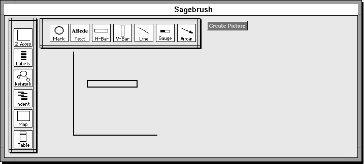
Figure 8 illustrates how the user further specifies the sketch by mapping data attributes to graphical properties. Each grapheme has several graphical properties that can be used for encoding information. Double clicking on a grapheme reveals icons representing its graphical properties. The horizontal bar grapheme¹s encoding properties are vertical-position (indicated by the small arrow pointing to the Y-axis), left edge and right edge horizontal positions (indicated by the small arrows pointing to the X-axis), and color (indicated by the striped icon to the left of the bar).
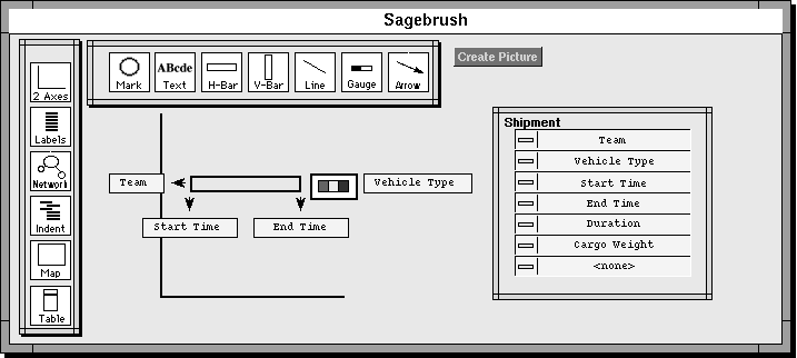
Some of the data attributes that a user has selected to be visualized are shown at the right of Figure 8. This table is constructed dynamically by dropping a data object onto the SageBrush frame. The type of object (in this case a transportation "shipment") is indicated in the header and users can incrementally add or remove attributes with a pull-down menu from each row.
This data set is related to the Visage logistics example described earlier and contains transportation schedule information for a set of supply shipments (e.g., shipment attributes are: the truck-driver team that will transport it, the type of vehicle required, the dates the trip will start and end, its weight). The goal is to view the demands placed on particular teams, potentially competing requirements for each vehicle type, the daily expected rates of moving supplies according to this schedule, and other relationships.
In Figure 8, a user has already assigned three attributes to the three positional graphical properties: Team to vertical-position, and Start Time and End Time to the horizontal positions of the left and right bar edges. The Vehicle Type attribute is assigned to the color property. Again the process consists of drag- and-drop operations from the data table to the property icons (the latter can be hidden to avoid clutter when the mapping is complete). The data-to- graphics mappings make the sketch more specific. Thus, the sketch now directs SAGE not only to use a horizontal bar in a chart but also how to use it.
The third snapshot of this process, Figure 9, shows the sketch with additional data and graphics. First, a mark (indicated as a circle) has been superimposed and centered on the bar. The Cargo Weight attribute has been assigned to its size property. Notice that the mark grapheme has five property icons for: vertical and horizontal position, color, size and shape. Second, the user has aggregated the set of shipments by date in Visage and dropped the aggregate on the SageBrush frame. This resulted in a second data table containing summary statistics organized by date: Daily Cargo Weight and Cumulative Cargo Weight. To visualize these, a second chart space has been added and aligned vertically with the previous chart. Two vertical bar graphemes have been added as well. The vertical position of the top of one bar has been mapped to Daily Cargo Weight (i.e. it will be represented against the vertical axis).
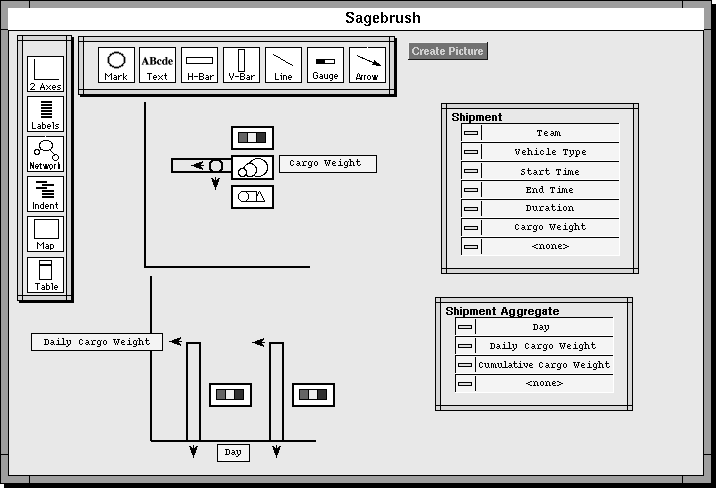
The three sketches shown in Figures 7, 8, and 9 are legitimate design specifications even though they are at different stages of completion. SAGE will complete any of these by attempting to map data attributes to grapheme properties and by adding additional graphemes or spaces if needed. This mechanism enables users to specify designs precisely but also permits them to partially specify designs when they are unsure of how to complete them or when they want SAGE to generate multiple alternatives. Of course, the extreme case is one in which no graphics have been specified and SAGE makes all decisions to generate one or more alternative visualizations for the selected data. In either case, we have encoded knowledge in SAGE for generating a variety of graphics from an incomplete sketch, ordered by effectiveness heuristics.
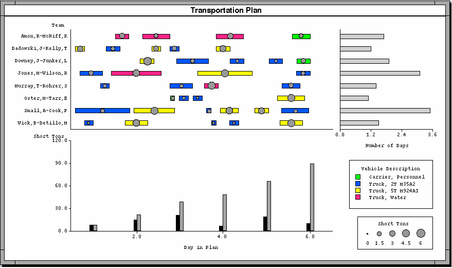
Figure 10 (see color plate 4) shows an integrative visualization based primarily on the sketch in Figure 9. It consists of three spaces (two of which were sketched in the figure). The chart with color-coded horizontal bars represents shipment attributes as specified in the sketches.
This graphic permits one to search rapidly for time periods during which two or more trucks of the same type are scheduled. For example, three red bars occur in overlapping time periods early in the schedule (indicating at least two Water Trucks are needed then). Relatedly, it is possible to detect teams that are idle during long periods or who must switch between different truck types repeatedly. The circle sizes enable one to spot the largest shipments. Notice that one truck type seems to have the heaviest shipments (the yellow ones).
The bottom chart presents the aggregated data. The short black bars show aggregates of shipment weights on a daily basis. The taller, increasing gray bars indicate Cumulative Cargo Weights and give a rough estimate of how quickly material is moved in this plan. Each bar includes the weights of shipments whose start times occur before it. Notice that it is possible to glance up from each bar and detect the relative contributions to the total made by the shipments in the chart (i.e. the relative circle sizes). Cumulative Cargo Weight was not actually placed on the bar in the sketch but SAGE was able to infer the need to place it there.
Finally, we have added a third aligned chart, showing yet another aggregation of the same shipment data. Shipments are aggregated by Team and the Total Duration of each team's shipments is displayed by a bar along the x-axis. Note how this aligned chart enables one to find crews spending the most time driving and then glance to the left to check whether this is due to many small trips or a few long ones and whether there is sufficient idle time between the trips.
This example was intended to illustrate several points. First, it shows another example of integrating many attributes in a collection of coordinated graphics. It also shows the need for interfaces that support composing graphics in flexible ways to meet the demands for visualizing novel combinations of attributes and novel aggregations of data sets. Third, it illustrates the use of SageBrush as one solution to this interface need.
The SageBrush interface approach supports a generative process of selecting and composing elements to specify visualizations. In contrast, SageBook supports a complementary process in which users browse a portfolio of previously created visualizations for ones that might be used in analogous ways for their new data. The design goal was to enable users to request sets of visualizations that: (1) contained data with characteristics similar to their data or (2) contained graphical elements of interest to them (e.g., visualizations with "color-coded bars on maps"). Additionally, we wanted to enable users to browse the results of these requests or the entire portfolio. To support browsing, we developed an interface using a hierarchical grouping of retrieved graphics by type (e.g., charts, tables, maps, networks; charts with bars, charts with lines, charts with points; etc.). When a visualization contained combinations of different types of elements (e.g., a visualization composed of an aligned chart and table) it is automatically classified and stored in multiple groups for browsing. This classification system was similar to one developed and verified empirically by Lohse et al. (1994) and reflects features that are salient to users.
Graphical queries are constructed with SageBrush using the same sketch techniques illustrated previously. For example, the sketch in Figure 7 is used to find all charts that have "interval" bars. Book searches its library and retrieves a set of nine graphics that match the query, as shown in Figure 11.
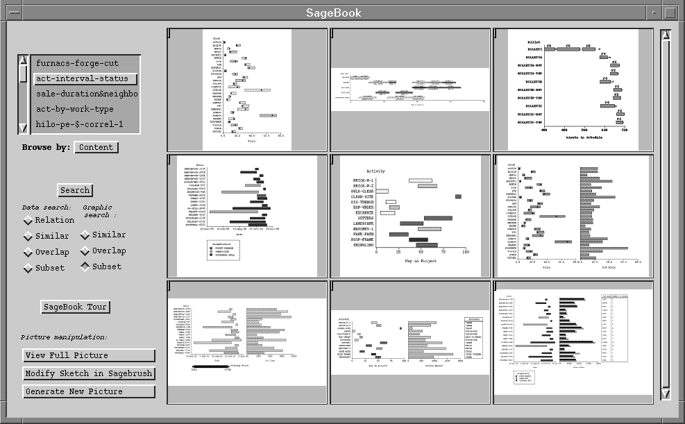
Book supports several search strategies (similar, overlap and subset), which determine the degree of similarity between the query sketch and the retrieved graphics. Figure 11 was generated using the subset criterion: all graphics were retrieved that included at least the elements in the query sketch (one chart space and one interval bar).
Data queries of SageBook's visualization portfolio are posed simply by selecting a set of data attributes from the SageBrush work area (e.g., Team, Start Time, Cargo Type). Book then searches for visualizations that contain similar types of data (e.g., visualizations containing nominals, dates, and quantities). These data characteristics are the same ones used by SAGE for making visualization design decisions (Roth & Mattis, 1990). As with graphical queries, there are several types of data query that affect the size of the retrieval set based on the similarity between the data associated with stored graphics and the data query.
SageBook provides a mechanism for facilitating browsing by grouping the retrieval set into piles of similar visualizations. Users can select one of these visualizations and perform another search for other graphics similar to it. In fact, it is possible to perform all searches without sketching a query in SageBrush, simply by browsing the portfolio and choosing examples there as the basis for searches.
While browsing visualizations, users can select one and request that SAGE create an analogous one for their data set. Sometimes, this "example" visualization does not map directly to a users' data. For example, it may have more or fewer graphical elements than are needed to express all the data attributes in the users' request. In these situations, SAGE attempts to repair the graphic by discarding and/or adding elements. Users can also transfer the example visualization to SageBrush and make changes to it themselves prior to generating a new one. Transferring a visualization to SageBrush has also turned out to be a good way for people to see how it can be specified by composing SageBrush elements.
Summary. The SAGE design engine and its accompanying interfaces, SageBrush and SageBook, are tools for designing graphics. They are most useful in domains like those we attempt to support with Visage, where users frequently explore relations among novel combinations of data. Visage aggregation operations also create new opportunities to combine information at different levels of granularity, another reason for dynamic creation of displays (as illustrated in Figure 10).
Our approach to user interfaces for creating visualizations attempts to provide users with multiple means of communication. SageBrush and SageBook permit very different styles of interaction that are useful for different tasks and levels of expertise. They are most interesting in the ways they complement each other in supporting different facets of visualization design. The following sections discuss these interfaces in terms of the dimensions used previously to discuss Visage. Again, we consider the role of multimodal enhancements in the same context.
Set Description. This dimension refers to the manner in which a set is expressed - as an enumeration of its elements or an explicit definition of its intension. There are two related contexts where the set description dimension is relevant: when people are conveying the visualization they would like SAGE to create and within the more focused task of requesting SageBook to retrieve a set of visualizations from its portfolio. In these two cases, one specifies a set of design elements (objects, spatial relationships, mappings to data) to constrain the creation or retrieval of visualizations.
When users construct a SageBrush sketch, they define the characteristics of a set. At one extreme, SageBrush provides a means for expressing a single, completely specified visualization and its mapping to data attributes. At another level, it provides a means to express a request for a larger space of visualizations that share a common set of partially specified preferences. This is equivalent to saying "Create all the alternative visualizations for viewing the data that have these features". The most extreme version of this is when no graphical choices have been made. The knowledge-based design component enables the high-level request, "create some visualizations of this data". Likewise, SageBrush provides a means of expressing SageBook portfolio queries explicitly (i.e. it enables expression of set intension).
In contrast to explicit specification, users may select an existing visualization as an example of their design preferences either for retrieving a new set from the portfolio or for creating a visualization of their data. Sometimes, this implicit specification can be very precise when the example does indeed represent exactly the design elements desired for their data. More often, users are less aware of the precise design elements implicit in the visualization they have selected. This is similar to the high level request, create a visualization for viewing my data like this one. The knowledge-based repair mechanism makes the interpretation of this request possible.
The potential for multimodal interfaces. There are several aspects of set creation in design specification where the addition of speech inputs together with these direct manipulation interfaces would be advantageous. As discussed earlier, speech is useful for retrieving objects by name or referring expression, especially when objects are not currently visible to the user. SageBook visualizations can be assigned names that must be typed in a dialogue box and perused using a folder-style metaphor. Although an interface like the Macintosh Finder would be helpful for requesting visualizations by name, speech would be more efficient.
Speech also enables referring to graphical properties without having to refer to particular objects. For example, to request graphics that use color or size in SageBrush, one must select a grapheme first (e.g., a line), then select its color or thickness property. However, this limits the retrieval set to visualizations where line thickness is used. In contrast, spoken referring expressions can be made without restricting them to object types (e.g., "find visualizations that use color or size"). Likewise, it is easier to refer to specific graphical or data values using speech (e.g., "find visualizations that use red and blue", "find visualizations with circles and diamonds", "find the visualization showing data for 1990 to 1995"). Finally, speech would support composing queries or requests that combine properties of both data and graphics (e.g., "find the red and blue charts showing interest rates by year", "find charts with vertical bars and dates along the x-axis").
Composability of actions. It is the combination of SageBrush and SageBook styles of expression that provide the most power, providing for precise specification, approximation through selection of examples, and high level design requests. Brush was designed with composability as the most important element. Book was designed to provide a source of design possibilities, but by itself provides little support for customization. Likewise, SAGE was meant to be a mechanism to provide the most appliance-like ("bread-maker") functionality (e.g., by supporting the basic command, "create a visualization of this data"). The visualizations it generates can still be modified in SageBrush. This property of combining appliance-like means of expression with fine-grained composability is similar to the Visage interface ideas we described earlier, where special-purpose scripted, appliance-like interfaces still contain visual elements that are subject to all basic direct manipulation operations.
The potential for multimodal interfaces. Many of the operations currently performed using direct manipulation might also be performed using speech. Our comments earlier about the kinds of incomplete specifications involving graphical properties that can be expressed in speech apply here as well.
One area where multimodal interfaces are likely to be of greatest value is in the iterative process of modifying existing visualizations. Currently, visualizations are modified by converting them back into SageBrush sketches, altering the sketch, and generating a new visualization (with changes in data and/or graphical properties). We are exploring direct manipulation interfaces for modifying visualizations directly. For example, just as double-clicking on a grapheme in SageBrush reveals its properties and the data attributes assigned to them (as in Figures 8 and 9), similar interfaces might be added to objects in visualizations. For example, this would make it easier to change the assignment of Cargo Weight in Figure 10 from circle size to circle saturation (i.e. gray- scale, where darker means heavier).
Speech inputs, coupled with direct manipulation pointing would provide a broader set of operations than simple graphical property changes. For example, one could change the bar chart on the right to a table by circling it and saying "Change this to a table". One could remove and add data attributes in a similar way (e.g., "remove the circles", "remove Vehicle Type from the bars", "change bar color to show Cargo Weight"). More complex changes are also worth exploring, such as "reorganize the shipment chart so Vehicle Type is along the y-axis and Team is shown in color". However, spoken requests like these depend on users learning more graphic design vocabularies, a problem discussed later. Nonetheless, multimodal interfaces have great potential for supporting both ends of the continuum, providing fine-grain, composable design operations and higher level abstract expressions.
Continuity of actions. Virtually all of the design operations involve discrete expressions and can therefore be performed using either direct manipulation or spoken inputs. The main exception to this is the spatial arrangement of graphemes in clusters. As Figure 9 illustrates, one can specify the relative positions of circles, bars, and other graphemes. Chart spaces can be aligned spatially as well. The specification of spatial arrangements like these requires continuous controls in the same sense that the scale and pan of frames in Visage, discussed previously.
Consistency with domain vocabulary. There are four different vocabularies involved in using SAGE visualization tools in the context of data exploration in Visage. First is a user's domain vocabulary: the terminology used to refer to analyses and concepts in users' tasks. The second vocabulary is that required by the database representations of domain concepts and the related navigation and manipulation operations. SAGE visualizations are a third vocabulary. Their function is to provide visual representations that are tools for performing information exploration. Nonetheless, the fact that they strive to integrate diverse information with novel graphical compositions means users need to spend time to understand how they work. A fourth vocabulary is required by the SAGE visualization creation interfaces: SageBrush and SageBook.
Our goal was to keep the difference between the vocabulary of the Brush and Book interfaces minimally different from that of the visualizations they are used to create. Our approach to minimizing this difference is to: (1) eliminate the need for users to use a design vocabulary in the first place by generating visualizations automatically whenever possible, (2) enable users to convey visualization requests by browsing and using other visualizations as examples, and (3) by creating a visual specification language (i.e. the SageBrush objects) that closely resembles the visualizations they represent.
Our experience has been that use of SageBrush alone takes practice. Users that have little visualization design exposure do not invent new visualizations nor do they anticipate easily the effects of SageBrush design operations. What makes it possible for them to become sufficiently familiar with SageBrush to use it effectively is its use with the SageBook portfolio and SAGE-generated alternatives. Whereas users do not immediately see the relation between SageBrush symbols and the resulting visualizations, they do quickly learn to use them to modify visualizations when these are converted into sketches. As a result, beginning users rely heavily on SageBook and SAGE to create visualizations and experienced users are much more likely to use SageBrush to create new visualizations.
The point here again is the utility of combining multiple means of expression to support acquisition of new vocabularies that are not integral to users¹ domain experience. The addition of speech to this environment raises the possibility of further reducing the burden of working with a new vocabulary. One impediment to the use of speech is the lack of familiar terminology for referring to all the design elements of visualizations. While users can easily refer to colors, bars, and lines, our experience is that they lack terms for referring to horizontal and vertical axes, the difference between simple and intervals bars (e.g., the difference between the color-coded interval bars in Figure 10 and the simple bars in the chart to the right), gauges, nodes and links in networks, and other objects.
Nonetheless, the lack of a common spoken vocabulary is likely to be mitigated by multimodal interfaces. Users can point to elements of visualizations and request components to be removed and copied in new ones. Furthermore, just as SageBook visualizations can be converted into sketches so users can modify and learn how to create them, terminology for referring to visualizations may be provided through balloon-style help or in answer to spoken questions about visualizations.
In previous sections, we focused on the creation of visualizations and interacting with them to manipulate the underlying data they represent. We described an information-centric approach to interaction that emphasizes representing information as first-class graphical objects and providing composable operations for data manipulation. We discussed the use of painting and related direct manipulation techniques for modifying the appearance of objects to support analysis. The purpose of this section is to generalize this approach to the manipulation of all graphical properties of objects that represent information.
The approach is called selective dynamic manipulation (SDM) (Chuah et al., 1995) . By selective, we stress the goal of providing a high degree of user control over the graphical object set to be manipulated, the properties of objects to modify, the operations people can apply, and the degree to which an operation affects a visualization. By dynamic, we stress the goal of supporting rapid interaction and animation to provide feedback to users' actions. By manipulation, we are stressing the new ways to interact with objects to transform their appearance (especially in 3D).
In order to explore this approach fully, we have developed a 3D prototyping environment for performing design experiments. Our goal is to incorporate the techniques that emerge here into the Visage environment. Our purpose in this paper is to convey another means of expression that involves interacting with objects in an environment with a pervasive, consistent, and intuitive physics.
There are several problems that occur in information visualization that we are addressing:
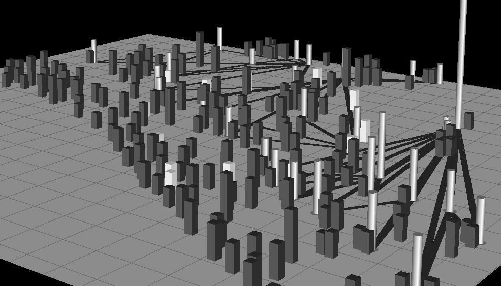
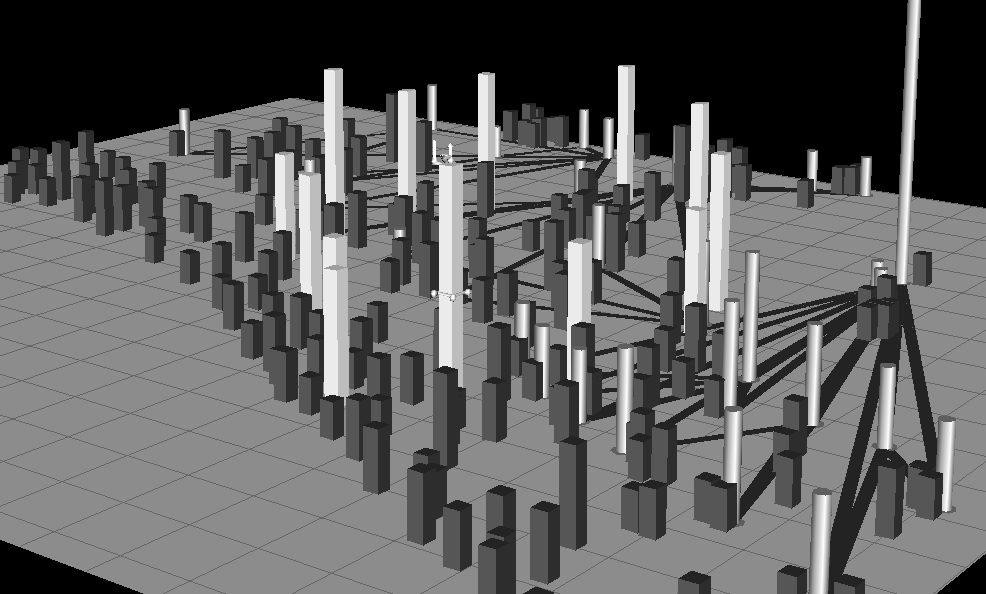
The data domain for our examples is the same as that described in the section on Visage: a large-scale supply distribution network. In Figure 12, supply centers are represented by cylinders, main routes between them by dark lines on the floor plane, and units that need supplies by rectangular bars. The heights of cylinders and bars indicate the quantities of material available at supply centers and needed by units.
The SDM approach allows users to control an object set by directly controlling any element within that set through handles illustrated in Figure 14 instead of menus of parameters. It is in contrast to the Magic Lens approach (Stone, Fishkin, & Bier, 1994), which allows users to control their views of objects by composing and manipulating lenses. Our use of handles was motivated by related work on 3D widgets (Herndon & Meyer, 1994; Herndon, van Dam, & Gleicher, 1994; Steven, Zeleznik, & Hughs, 1994) and by 2D scaling handles in draw programs.
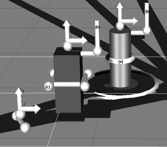
Attaching a handle to an object in a selected set and pulling or pushing its parts causes all objects in the selected set to change in the same way. This is a generalization of the approach used in Visage, in which dragging an object also drags all other objects that are currently painted the same color. The handles were designed to look similar for different object types so that users need not remember the functions of many visually distinct handles. For example, moving the vertical rods labeled (b) in Figure 14 causes the cylinder and rectangular bar to stretch vertically (which is how the white bars are stretched in Figure 13). Grabbing the lines with arrowheads provides movement in one dimension. Grabbing the small sphere at the top of each object produces three-dimensional movement. Moving the ring around the cylinder expands and contracts its diameter. Similarly, the lines and spheres on the sides of the rectangular bar modify its dimensions. When handles are pulled or pushed, the objects contract, expand or move continuously. Using animation in this way helps users perceive and make changes to objects more easily.
Differentiating focus sets in context. While navigating through an information space, it is often necessary for users to focus on parts yet still know where they are in the full space. Focus can be achieved with several strategies. Some objects can be painted so that they appear visually distinct from other elements of the environment. Objects can also be made more salient by increasing their size. Spatial context is maintained in these cases because the objects are not moved from their original positions. However, some context may be lost because enlarging the selected objects may cause other objects in the scene to be occluded.
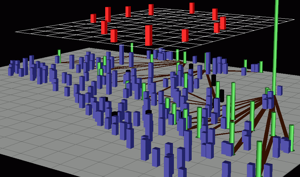
Alternatively, users can move all focus objects to the front or elevate them above the scene as in Figure 15 (see color plate 4). Context is still maintained because object shells (shown in black) are left behind. In addition, a user can move the focus set back and forth between its home position and its position at the front of the scene to achieve better scene context.
Viewing and Analyzing Occluded Objects. Occlusion is closely related to the task of focusing while maintaining context. As was previously mentioned, expanding the selected objects may introduce occlusion, but this can be prevented by elevating the objects before expanding them.
Figure 12 shows a dense information space with the interest bars shown in white and barely visible. Many of the interest objects are partially if not fully occluded. After elevating the interest objects we can clearly see the pattern that they form (Figure 15). Another way to deal with occlusion is to make all objects, other than the interest set, invisible. This method, however, sacrifices scene context.
The occlusion problem can also be solved by reducing to zero the heights of objects that are not of interest, as in Figure 16. In this way, the spatial position of the other objects with respect to the interest objects is maintained. However, their height patterns are lost. Alternatively, users may make all objects other than the interest objects very thin, as in Figure 17. This allows us to view the interest set clearly as well as use object heights to maintain information about the amount of supplies a center has or that units need. We are also exploring the use of transparency to deal with object occlusion.
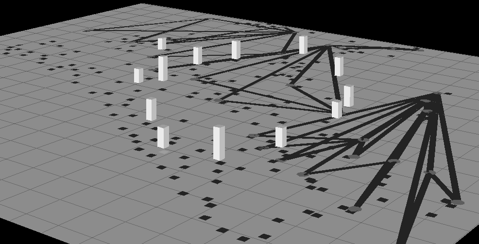
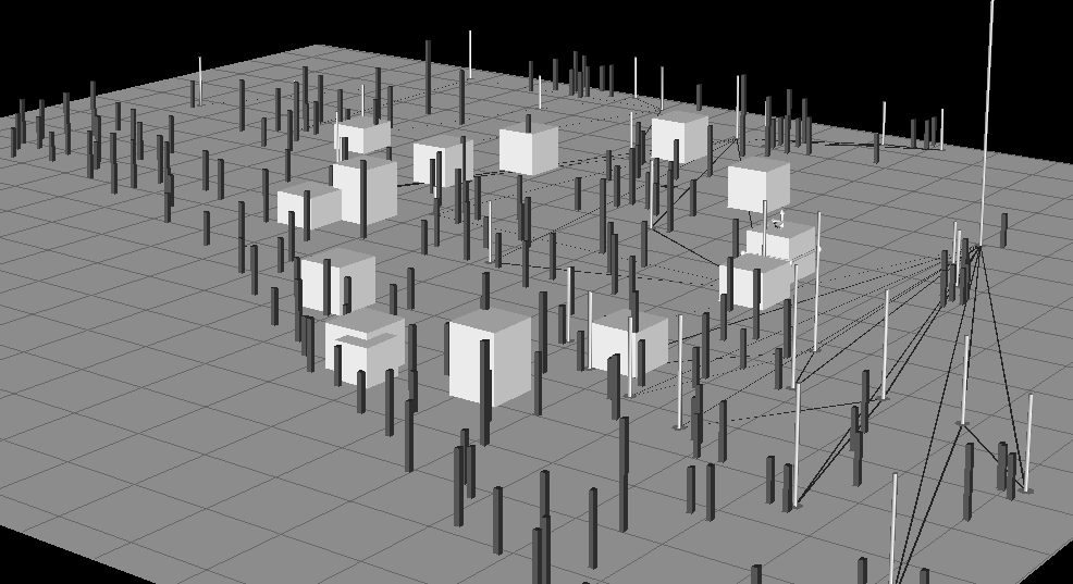
Viewing Different Sets of Elements Based on Different Scales. In large information spaces, the widths and heights of objects are often quite diverse. As a result, the scale used may dwarf some objects and make it difficult to observe width and height relationships among them. This problem is worsened by the aggregation operation, which can create aggregate objects that show the total value of all its members. These objects will have much greater values associated with them compared to the other objects in the environment.
For these reasons it is important to provide ways to view different data sets with different scales (Herndon, van Dam, & Gleicher, 1994). SDM allows users to do this. Suppose a user wants to compare a set of units (white bars in Figure 12) with small supply needs and see whether the distribution of those units is in any way related to the neighboring units, routes, and supply centers. To perform this task, the user can scale up the heights of the selected objects, so they can be compared more easily (Figure 13). A ratio axis is typically added to the interface to indicate degree of distortion of the selected items relative to the scale of the environment.
Comparing the Patterns, Widths, and Heights of Objects. In the data analysis process, users frequently compare the various attributes of data objects. In a visualization, this task is simplified to that of comparing properties of graphical objects. However, comparing object widths and heights is difficult in 3D visualizations when objects are at different distances from the user viewing point. The same problems are encountered in 2D visualizations when trying to compare the lengths of interval bars (as in Figure 10) that are distributed throughout a chart.
SDM allows users to easily perform comparisons among objects of different depths by giving users the ability to draw a line of reference in the scene plane. Users can then move any set of objects to the reference line. By lining up objects in this way, their heights can be easily compared. Figure 18 shows a visualization after selected objects have been pulled to the reference line. To maintain the relationship between objects and their shells, users may paint the objects which will cause their shells to also be painted. Users may also slide the objects back and forth between the reference line and their home points.
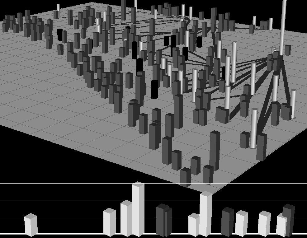
In addition to making comparisons within sets, users may also compare height trends among multiple sets. Figure 18 shows that the user has lined-up two different sets of objects. From the two lined up sets it is clear that one set (in white) has larger height variations than the other.
In summary, the goal of this section was to illustrate a natural extension of the information-centric approach in which objects are manipulated to alter their appearance. The important elements of this approach are:
Direct manipulation techniques like the ones described here are critical for supporting dynamic continuous changes to object appearance. However, there is also great potential for composite actions to be created from the primitive SDM operations, but initiated by spoken commands. Spoken commands would express the intent of multiple composed primtive actions (e.g., "make the red objects more visible", "shrink everything but the red objects", "compare the red and black objects").
This paper presented our work on electronic workspaces for visualizing and manipulating information, including:
We presented our work on Visage, an environment for integrating multiple tools and representations of information. Visage's main components include:
Our goal in designing SAGE was the ability to produce integrative visualizations: those that combine multiple graphical properties, objects, and spaces (i.e. charts, maps, tables, and networks) within a single frame to express numerous data attributes. Our approach to supporting design has been to integrate SAGE with two interactive design tools called SageBrush and SageBook. SageBrush is representative of design tool interfaces in which users construct sketches from a palette of primitives and/or partial designs. SageBook is an interface for browsing and retrieving previously created visualizations (i.e. complete, rendered designs) and utilizing them to visualize new data. SageBook supports an approach to design in which people remember or examine previous successful visualizations and use them as a starting point for designing displays of new data. Together, these interfaces permit very different means of communication that are useful for different tasks and levels of expertise.
We presented our design explorations using selective dynamic manipulation (SDM) to provide users with the ability to control the appearance of all the visual properties of objects. By selective, we stress the goal of providing a high degree of user control over the graphical object set to be manipulated, the properties of objects to modify, the operations people can apply, and the degree to which an operation affects a visualization. By dynamic, we stress the goal of supporting rapid interaction and animation to provide feedback to users' actions. By manipulation, we are stressing the new ways to interact with objects to transform their appearance. We studied these processes in both 3D and 2D environments and are incorporating them within Visage. Visage's brushing and painting operations are a first step towards this approach.
In addition to describing our approach to visualization, we presented dimensions by which user interfaces can be characterized to better understand the means of expression they must support. Four dimensions emerged repeatedly in our design of information visualization and exploration workspaces:
We also discussed the need to create user interfaces that integrate multiple ways for people to express their intentions while performing tasks. Thus far we have attempted to address these needs with multiple direct manipulation techniques. We proposed several functions that would be better served by multimodal interfaces providing speech inputs that complement direct manipulation interfaces. In particular, we proposed the use of speech to augment interaction with visualizations to:
We believe that an information-centric user interface approach is well suited to enabling users to interact with visualizations using multimodal interfaces that combine speech with direct manipulation. Knowledge-based visualization mechanisms that provide graphically articulate presentation systems like SAGE may also enable systems to better interpret users' spoken requests about visualizations. These mechanisms provide a vocabulary for describing the syntax and semantics of visual representations of data, the characteristics of data that are relevant to designing visualizations, and the characteristics of tasks people must perform with visualizations of their data. Just as this vocabulary has been useful for automating the mapping of graphics to data to support tasks, it may also prove to be useful for understanding users' spoken requests that refer to graphics, data and tasks.
Acknowledgments. The authors acknowledge the substantial contributions to the development of ideas and systems discussed in this paper made by the following people: Michael Burks, Mark Derthick, Carolyn Dunmire, Cristina Gomberg, Joseph Mattis, Jeffrey Senn, and Philip Stroffolino. We would acknowledge the helpful suggestions made by Nancy Green and the reviewers of this paper.
Support. This work was supported by research contracts from the Army Research Laboratory and Defense Advanced Research Projects Agency.
Authors' Present Addresses
1. Ahlberg, C., & Shneiderman, B. (1994). Visual information seeking: tight coupling of dynamic query filters with starfield displays. Proceedings of the CHI '94 Conference on Human Factors in Computing Systems, 313-317. New York: ACM.
2. Ahlberg, C., & Wistrand, E. (1995). IVEE: An environment for automatic creation of dynamic queries applications. Proceedings of the CHI '95 Conference Companion on Human Factors in Computing Systems, 15-16. New York: ACM.
3. Ballay, J. M. (1994). Designing Workscape: An interdisciplinary experience, Proceedings of the CHI'93 Conference on Human Factors in Computing Systems, 10-15. New York: ACM. Becker, A., & Cleveland, W. S. (1982). Brushing Scatterplots. Technometrics, 29(2), 127-142.
4. Bederson, B.B., & Hollan, J.D. (1994). PAD++: A zooming graphical interface for exploring alternate interface physics. Proceedings of the UIST 94 Symposium on User Interface Software and Technology, 17-27. New York: ACM.
5. Brachman, R.J. et. al. (1993). Intelligent Support for Data Archaeology. Proceedings of Workshop on Intelligent Visualization Systems, 5-19.Los Alamitos, CA: IEEE.
6. Card, S.K., Robertson, G.C., & York, W. (1996). The WebBook and the Web Forager: An Information Workspace for the World-Wide Web, Proceedings of the CHI'96 Conference on Human Factors in Computing Systems, 111-117. New York: ACM.
7. Casner, S.M. (1991). A Task-Analytic Approach to the Automated Design of Graphic Presentations. ACM Transactions on Graphics, 10(2), 111-151.
8. Chuah, M.C., Roth, S.F., Mattis,J., Kolojejchick, J., & Juarez, O. (1995) SageBook: Searching data graphics by content. Proceedings of the CHI'95 Conference on Human Factors in Computing Systems, 338-345. New York: ACM.
9. Chuah, M.C., Roth, S.F., Mattis,J., & Kolojejchick, J. (1995). SDM: Selective Dynamic Manipulation of Visualizations, Proceedings of the UIST'95 Symposium on User Interface Software and Technology, 61-70. New York: ACM.
10. Chuah, M.C., Roth, S.F., & Kerpedjiev, S. (1997). Sketching, Searching, and Customizing Visualizations: A Content-based Approach to Design Retrieval. In M. Maybury (Ed.), Intelligent Multimedia Information Retrieval, Menlo Park, CA: AAAI/MIT.
11. Cohen, P. R., & Oviatt, S. L. (1995). The Role of Voice Input for Human-Machine Communication. Proceedings of the National Academy Of Sciences, 92(22), 9921-9927.
12. Eick, S. G., & Steffen, J. L. (1992) Visualizing code profiling line oriented statistics. In Proceedings of Visualization '92, 210-217. Los Alamitos, CA: IEEE.
13. Goldstein, J., Roth, S.F., Kolojejchick, J., & Mattis, J. (1994) A framework for knowledge-based interactive data exploration, Journal of Visual Languages and Computing, 5, 339-363.
14. Gray, P.D., Waite, K.W., & Draper, S.W. (1990). Do-It Yourself Iconic Displays, Human-Computer Interaction - INTERACT '90: Proceedings of the IFIP TC 13 Third International Conference on Human-Computer Interaction, 639-644. New York: Elsevier Science Pub. Co.
15. Herndon, K.P., & Meyer, T. (1994). 3D widgets for exploratory scientific visualization, Proceedings of the UIST '94 Symposium on User Interface Software and Technology, 69-70. New York: ACM.
16. Herndon, K.P., van Dam, A., & Gleicher, M. (1994). Workshop report: The challenges of 3D interaction. Proceedings of the CHI '94 Conference on Human Factors in Computing Systems, 469. New York: ACM.
17. Holsheimer, M., and Siebes, A. (1994). Data mining: The search for knowledge in databases (Report CS-R9406, Amersterdam, The Netherlands: Centrum voor Wiskunde en Informatica, Computer Science/Dept. of Algorithmics and Architecture.
18. Johnson, B., and Shneiderman, B. (1991). Tree-Maps: A space-filling approach to the visualization of hierarchical information structures. Proceedings of the Symposium on Information Visualization, 284-291. Los Alamitos, CA: IEEE.
19. Krasner, G. E., & Pope, S. T. (1988). A Cookbook for Using the Model-View- Control User Interface Paradigm in Smalltalk-80. Journal of Object-Oriented Programming, 1(3), 26-49.
20. Lohse G. L., Biolsi, K., Walker, N., & Reuter, H. H. (1994). A Classification of Visual Representations. Communications of the ACM, 37(12), 36-49.
21. Lucas, P., & Roth, S. F., Exploring Information with Visage, Video Proceedings of the CHI'96 Conference on Human Factors in Computing Systems. New York: ACM.
22. Mackinlay, J. (1986). Automating the design of graphical presentations of relational information, ACM Transactions on Graphics, ACM, 5(2), 110-141.
23. Marks, J., A (1991). Formal Specification Scheme for Network Diagrams that Facilitates Automated Design, Journal of Visual Languages and Computing, 2, 395-414.
24. McDonald, J. A., (1990). Painting multiple views of complex objects. Proceedings of the ECOOP/OOPSLA '90 Conference, 245-257. New York: ACM.
25. Oviatt, S. L. (1996). Multimodal Interfaces for Dynamic Interactive Maps. Proceedings of the CHI'96 Conference on Human Factors in Computing Systems, 95-102. New York: ACM.
26. Plaisant, C., Milash, B., Rose, A., Widoff, S., & Shneiderman, B. (1996). LifeLines: Visualizing Personal Histories. Proceedings of the CHI'96 Conference on Human Factors in Computing Systems, 221-227. New York: ACM.
27. Rao, R. & Card, S. K. (1994). The Table Lens: Merging Graphical and Symbolic Representations in an Interactive Focus+context Visualization for Tabular Information. Proceedings of the CHI'94 Conference on Human Factors in Computing Systems, 318-322. New York: ACM.
28. Robertson, G.G., Mackinlay, J.D., & Card, S.K. (1991). Cone trees: Animated 3D visualizations of hierarchical information. Proceedings of the CHI'91 Conference on Human Factors in Computing Systems, 173-179. New York: ACM.
29. Roth, S.F. (1996).The SAGE Project. http://www.cs.cmu.edu/~sage.
20. Roth, S.F. & Mattis, J.A. (1990). Data Characterization for Intelligent Graphics Presentation. Proceedings of the CHI'90 Conference on Human Factors in Computing Systems, 193-200. New York: ACM.
21. Roth, S. F. & Mattis, J. (1991). Automating the Presentation of Information. Proceedings of the Conference on AI Applications, 90-97. Los Alamitos, CA: IEEE.
22. Roth, S.F., Kolojejchick J., Mattis J., & Goldstein J., (1994). Interactive Graphic Design Using Automatic Presentation Knowledge. Proceedings of the CHI'94 Conference on Human Factors in Computing Systems, 112-117. New York: ACM.
23. Spence, B., Tweedie, L., Dawkes, H., & Su, H. (1995). Visualisation for Functional Design, Proceedings of the Symposium on Information Visualization, 4-9. Los Alamitos, CA: IEEE.
24. Stevens, M.P., Zeleznik, R.C., & Hughs, J.F. (1994). An architecture for an extensible 3D interface toolkit. Proceedings of the UIST '94 Symposium on User Interface Software and Technology, 59-67. New York: ACM.
25. Stone, M.C., Fishkin, K., & Bier, E.A. (1994). The movable filter as a user interface tool. Proceedings of the CHI '94 Conference on Human Factors in Computing Systems, 306-312. New York: ACM.
26. Tessler, L. (1981). The Smalltalk Environment, Byte Magazine, 6(8), 90-147.
27. Tufte, E. R. (1983). The Visual Display of Quantitative Information. Cheshire, CT: Graphic Press.
28. Tukey, J.W. (1977). Exploratory Data Analysis, Reading, MA: Addison-Wesley.