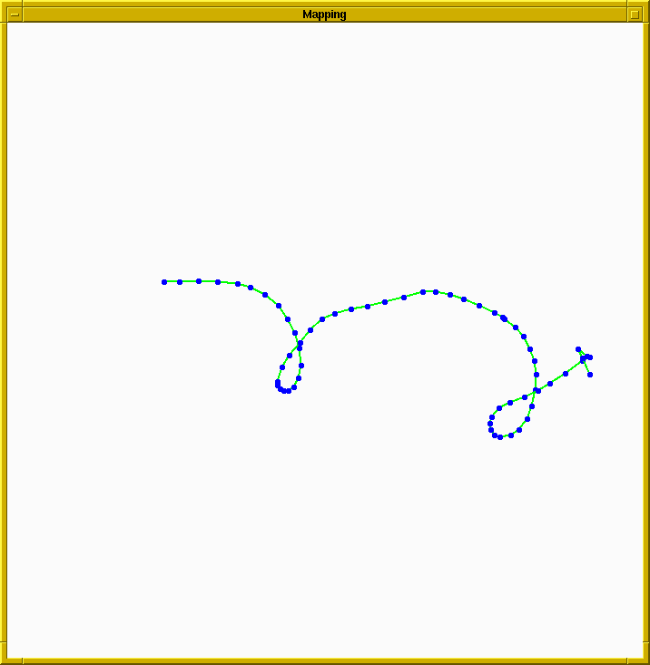
Figure 1. Dead reckoning output
Here's a plot of some dead reckoning output from a robot we tested on the FRC Patio in September. The robot had one broken wheel on the front right side. The operator drove the robot in a large loop, but because of severe systematic errors, the dead reckoning estimated that the robot drove in the trajectory below.
In Figure 1, the blue dots are robot poses that were estimated from the discrete motion measurements taken through odometry. The green lines simply connect consecutive robot poses and can be thought to represent odometry measurements which relate consecutive poses of the robot. The actual path that the robot traversed was a closed oval-shaped loop. The broken wheel causes a severe bias in odometry which shows up as a corckscrew shaped trajectory.
The result shown here was obtained from a robot with a mechanical problem which greatly exaggerates the tendency of the pose estimate to drift, but this sort of behavior may be seen by a fully functional robot if it drives for a very long time. The relationship between small incremental errors and large cumulative errors still exists, it's only a matter of time before they become as significant as shown above.
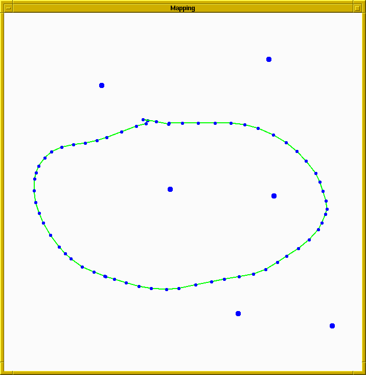
The blue dots off by themselves in this plot are the estimated landmark locations. This trajectory estimate is much closer to the actual trajectory. Unfortunately there is no real ground truth position information since the dGPS was not working and we did not survey the robot position during testing. However, we carefully marked the starting point of the robot, and to within the driver's ability to control the vehicle, the robot ended up at the same point. This is recovered in the trajectory estimate shown in Figure 2. The starting point and ending point are labelled in this image. The strange looking part of the trajectory just to the left of the start/end point is where the driver backed the robot up when he noticed that he was not turning sharply enough to drive back to the starting point. The maneuver was made more difficult with the broken wheel.
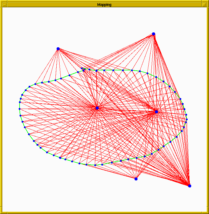
Below is another plot of the same result with the bearing measurements drawn in red for visualization purposes. I apologize if the plot is unclear, it will either show more clearly how well the bearing measurements and odometry measurements align with the underlying model, or it will look like a pile of colored spaghetti.
These results were obtained as follows:
This animation shows the results of a full batch estimation technique
applied each time a new measurement was made. The result is of course
very nice, but the technique is very slow since it requires updating
using all of the measurements every time. The research that I am
planning to do, which is explained in my thesis proposal, focusses on
changing the way that the map and trajectory are parameterized, and
develops a concept which should greatly reduce the computation
required for solving this estimation problem. The aim of the proposed
work is to come up with an algorithm which will produce accurate,
globally consistent maps, in a manner which is reasonably efficient
and robust to outliers.
