
Imagine that we are given the following generative model: with 50% probability we generate a data point from a standard normal distribution (mean 0, variance 1), while with the other 50% probability we generate a data point from a normal distribution with variance 1 and adjustable mean x. We have observed some data points, and we wish to adjust x to maximize their likelihood.
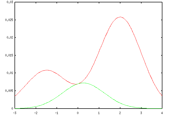
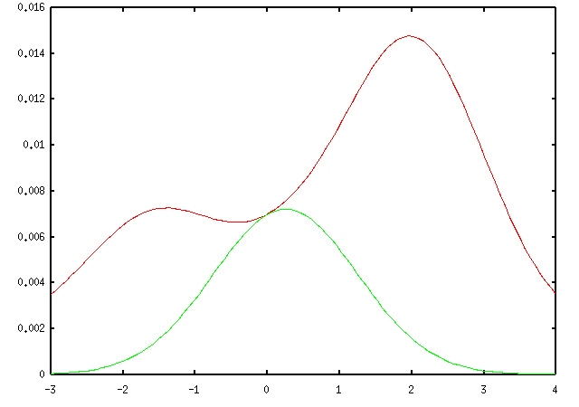
Suppose further that our data points are a=2 and b=-1.5, and that we are told that either a or b comes from the Gaussian centered at 0 (but not both). In that case, there are only 2 data association possibilities: either a came from center 0 and b came from center x, or a came from x and b came from 0. The probability of the data under these two hypotheses are given by the red and green curves below, while the overall probability of the data is the sum of these two terms (given by the blue curve).
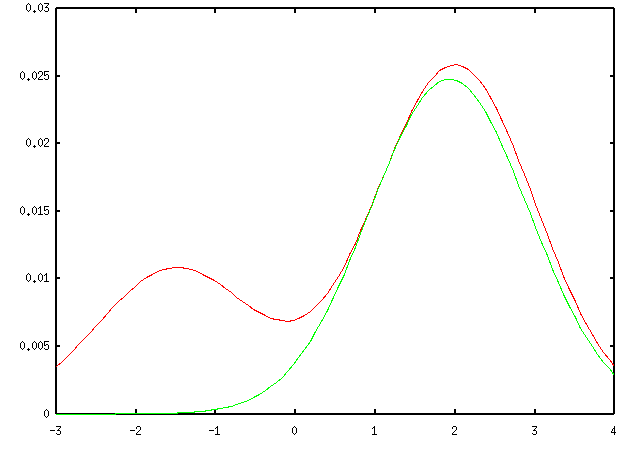
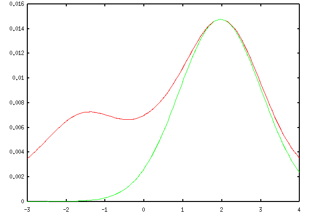
We can lower-bound this likelihood by choosing a distribution over the two data association hypotheses and plugging it into the variational bounding inequality. Each such distribution provides a different bound on the likelihood; one of these bounds is shown below.
Here is the same bound on the log scale. In this plot it is more obvious that the log bound is quadratic (which means the original bound was Gaussian).

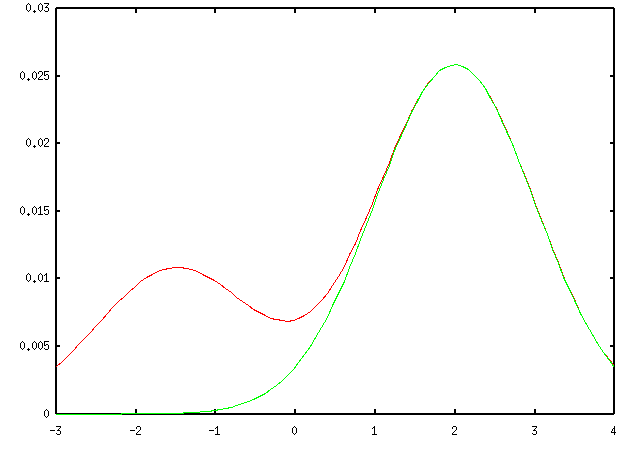
The most likely value of x under the above bound is about x=0.3. So, we can set x=0.3 and try to find a bound which is tight at x=0.3. Here is such a bound:

Optimizing over x now gives about x=1.1, and we can optimize our bound again for this value of x:
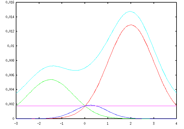
Finally, plugging in x=1.9 and optimizing the bound gives:
which has a maximum very near the true maximum of the log likelihood.
We can do the same trick without the assumption that a and b came from different centers. In this case there are 4 possible data association hypotheses:
The data association for a is now independent of the data association for b if we hold x fixed, so we can optimize those two probabilities separately. The resulting iteration looks the same as if we had optimized just one distribution over the 4 possible associations, but it scales much better with more data. If we have N data points and 2 centers, then instead of needing to estimate one probability distribution over 2N data association hypotheses, we can optimize N separate distributions, each over 2 hypotheses.


Here is the gnuplot source which generated the images on this page. This page is maintained by Geoff Gordon and was last modified in November 2002.