Matthew Banner
15-463 Fall 2007

Energy Function Comparison
I tried two different energy functions: a simple gradient
function and a correlation using the Laplacian of Gaussian.
You can see a comparison of these two below. Notice that
the images produced using the gradient function tend to
have their geometry preserved but sometimes contain sharp
edges where seams have been removed. The LoG function,
on the other hand, seems to produce smoother borders
between different sections of the image, but often
distorts the geometry thereof. I find images produced using
the LoG function to be preferable, so all images shown
here other than the comparison below were created in that manner.
The largest images are not shown so as not to distort the
layout of the page, but it's really the narrower ones that
are interesting. This image was chosen for the comparison
because it contains both elements that are handled effectively
by the algorithm as well as some which are not.
Successful Images
| In this image, the algorithm successfully removes the sky
as well as some of the beach while leaving the abondoned ships
mostly intact (source). |

|

|
| Although the train is somewhat compressed in this image,
notice how much more the back end, where it is hard to distinguish
from the background, is than the sharper, more distinct front end (source). |

|

|
| Notice how the sky is first removed, followed by the sand. This
leaves the trains in the middle nearly untouched except that they now
appear to be resting along a ridge (source). |

|

|

|
| It would not have been a true computational photography project without
the Russian Guy in the Blue Shirt. Notice how the featureless wall is removed,
leaving the subject completely intact (source). |

|

|
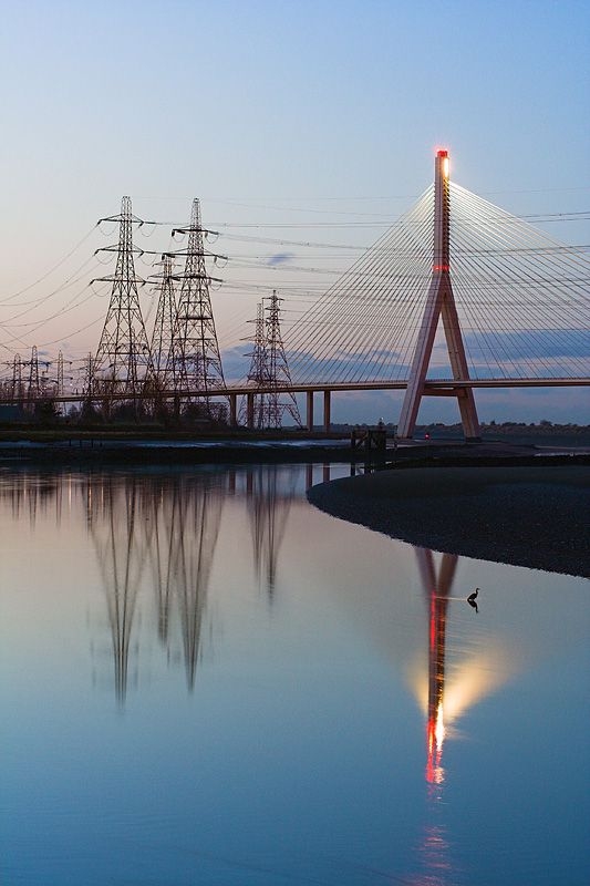
| Here, the height of the image is reduced without removing
the highlights of the bridge's reflection (source). |
|

|
| We are able to greatly reduce the height of the image
without losing the details of the sky (source). |

|

|
Unsuccessful Images
| Unfortunately, the least interesting portions of this photo
(according to my energy function) were the towers of the church.
This led to the unfortunate tendency of the structure to look as
if it were melting (source). |

|

|
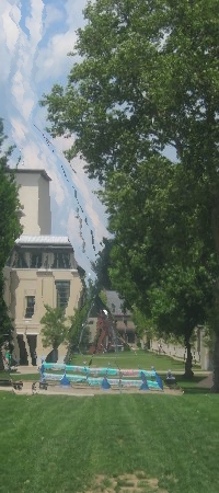
| These look pretty good as long as you don't compare the trunk of the
tree with its reflection (source). |

|

|
The End


